


Removal of material in decorative pattern creates sparkle of light on plain steel chair back
Posted in Found Objects, tagged decoration, holes, metal, patina, patterns, sparkle, value on March 7, 2012| Leave a Comment »
Removal of material in decorative pattern creates sparkle of light on plain steel chair back
Posted in Design Projects, tagged COR-TEN steel, corten steel, dog, furniture, garden, isba, landscape architects, materials, metal, planter box, weathering steel on March 3, 2012| 1 Comment »
Weathering Steel or COR-TEN steel weathers to a nice coppery brown color, then stops rusting for the most part. John welded up this planter box for a garden in Rockridge, CA this morning.

corten steel planter box

Isba supervises

Welder and two Landscape Architects
Posted in Found Objects, tagged bridge, color, colored concrete, desert architecture, diamond, metal, rattlesnake, steel, Tucson, turquoise on February 28, 2012| 2 Comments »
On a recent visit to Tucson, Arizona I saw this cool bridge for bikes and pedestrians over East Broadway Blvd . (If you zoom into the map and switch to satellite you can see the extent of it. It was designed by Simon Donovan. I also liked the bright blue bollards and railing. This particular color looks just right in the Sonoran desert, but Im not sure why. You will see the identical color in another post later this week. The painted steel mesh skin really looks like a snake – kind of like a dry, discarded snake-skin. The shadows created by the crisscrossing steel are also quite nice.

Three southwestern blue bollards

Southwestern blue ramp railing

snake-skin

Rattlesnake tail

Looking through the snake

Tucker exits the snake mouth

Snake head through the trees

Snake bridge body through the trees

Dagmar and Tucker walk back through towards the tail
Posted in Found Objects, tagged aluminum, metal, roof, utilitarian, water management on March 31, 2011| 1 Comment »

My friend Carl Milsum just installed this simple and sturdy new aluminum entry roof to protect visitors at his front door. It might look better without the diamond plate, but I think he got a special deal on this material.


Posted in Design Projects, tagged cabin, exposed beams, fibercement, fir, lighting design, mendocino, metal, philo, recycled, redwood, salvaged, small buildings, vaulted ceiling, wood on February 22, 2011| Leave a Comment »
I recently paid a visit to the little cottage in Philo that I designed a few years ago. I was happy to see that the owners were using the cozy little space and had decorated in good taste. I took a few pictures since I only have photos of the unfurnished rooms on my website.

Finally they moved a couch into the little cabin…and lots of other things too

The builder took the liberty to use some of the 100 year old salvaged redwood siding from my house in Berkeley to make this cute little vent cover

Still no art on the tall southern wall. stay posted. I think a painting will be installed soon

The loft above has been furnished too! complete with a painting of bruce lee and sheer curtains!
Posted in Found Objects, tagged bright colors, camoflage, color, desert architecture, desert colors, grand canyon national park, landscape, Mary Coulter, metal, metal railings, national park architecture, patterns, railing, stone on November 21, 2010| Leave a Comment »
The architectural highlights of my visit to the south rim of the Grand Canyon were a study in contrasts.
Mary Coulter’s Lookout studio, perched right on the rim is built of the canyon limestone and meant to blend right into the backdrop.

Lookout Studio from afar
She is successful in this goal. Up close, once you realize there is a building, the rustic charm is clear.

Lookout Studio: 1914, Designer Mary Colter, rough cut limestone to blend with the surroundings

On the other end of the spectrum, there are many buildings and parts of buildings painted vibrant colors. These sorts of color schemes are best in the bright clear sunlight of the desert or tropics.

The bright desert sun on some bold color choices

Bright painted doors
I included a photo of the curving metal railing that follows the rim just because it is simple and elegant without being institutional.

elegant curving railings at the edge of the canyon
Posted in Found Objects, tagged Brooklyn, derelict chic, lighting design, metal, New York, restaurant, rustic, tile, wood on September 21, 2010| 2 Comments »
I just ate dinner at this cool restaurant in Brooklyn. It was dark outside the whole time I was there. I am sure the place would feel pretty different for breakfast.
 The building is an old diner train car with all the inherent architectural charm that you might imagine….. cozy narrow space, curved ceiling, lots of windows.
Instead of accentuating the 50s style, this restaurant has a different, edgier and classier sort of atmosphere.

It easily could have been overly trendy with its “derelict” finishes (ala Zoolander)

The old tile floor is patched with no attempt to hide that fact that it has been patched.
but some how it just works.
 Once again the lighting is key. In this case the general lighting is dimmed, and warm flickery candlelight creates the mood. Mirrors, shiny ceiling and glass tiles add to the sparkle.

Lara Kaufman, who took most of these photos for me, is pictured on the right and Elissa Steglich, the local friend who took us here is on the left

Photo from Lara K showing some artful floor patches
Posted in Design Projects, tagged formica, holes, house surgery, kitchen, lighting design, metal, metal edgebanding, value on July 28, 2010| 4 Comments »
This is my first post. I wanted to share a few kitchen design ideas and, in particular, a partial, tight-budget kitchen remodel that I assisted with in Alameda, California. The client, it turns out, has a great design sense herself, but she needed a bit of help.
I was hired to do a partial, tight-budget upgrade to this kitchen:
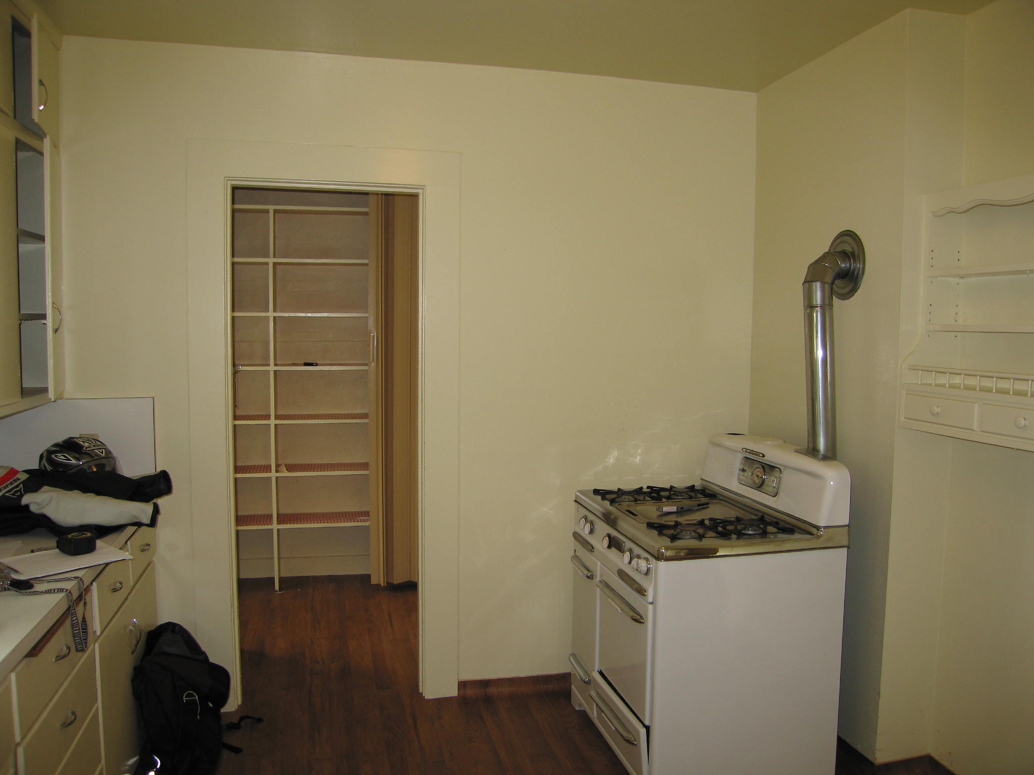
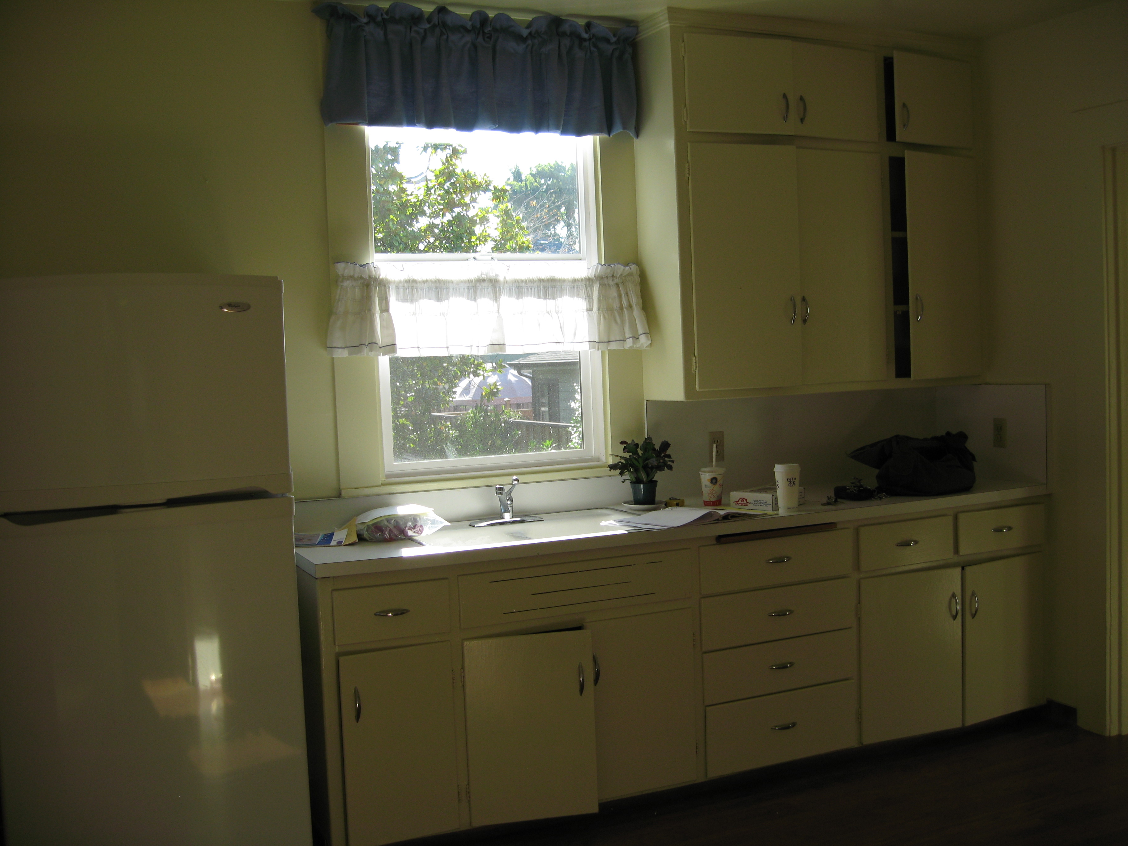
This side of the kitchen we didnt change much.
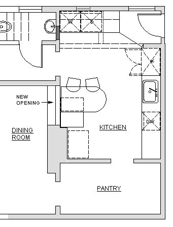
I started by measuring and discussing her needs and visions for the space. She wanted to keep the half of the kitchen with the sink, but tear out a wall and add some new cabinets and a laundry area on the other side.
We did add a dishwasher…and the client took away one curtain ruffle
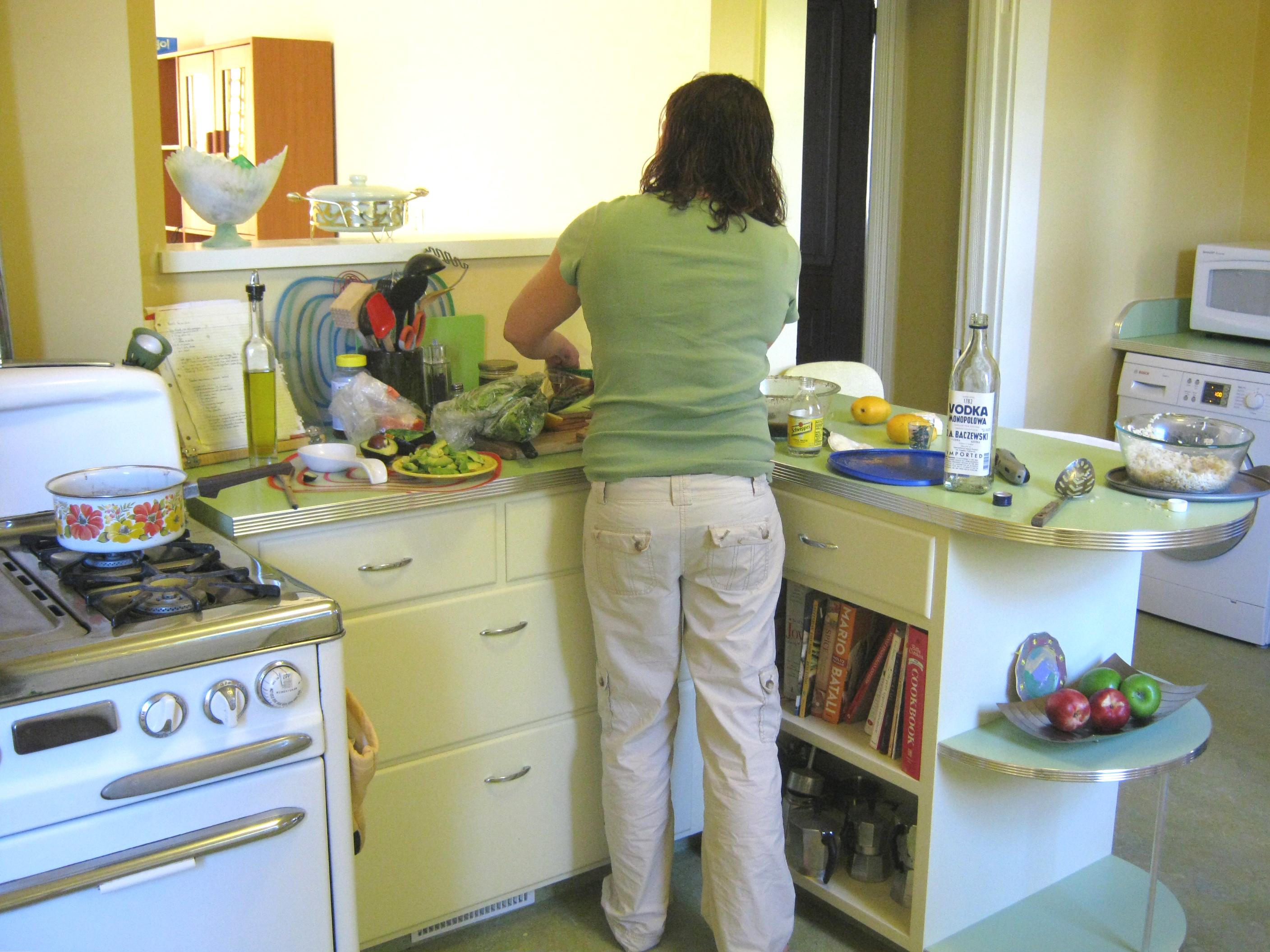
Can you see the metal edge banding on the counter top?
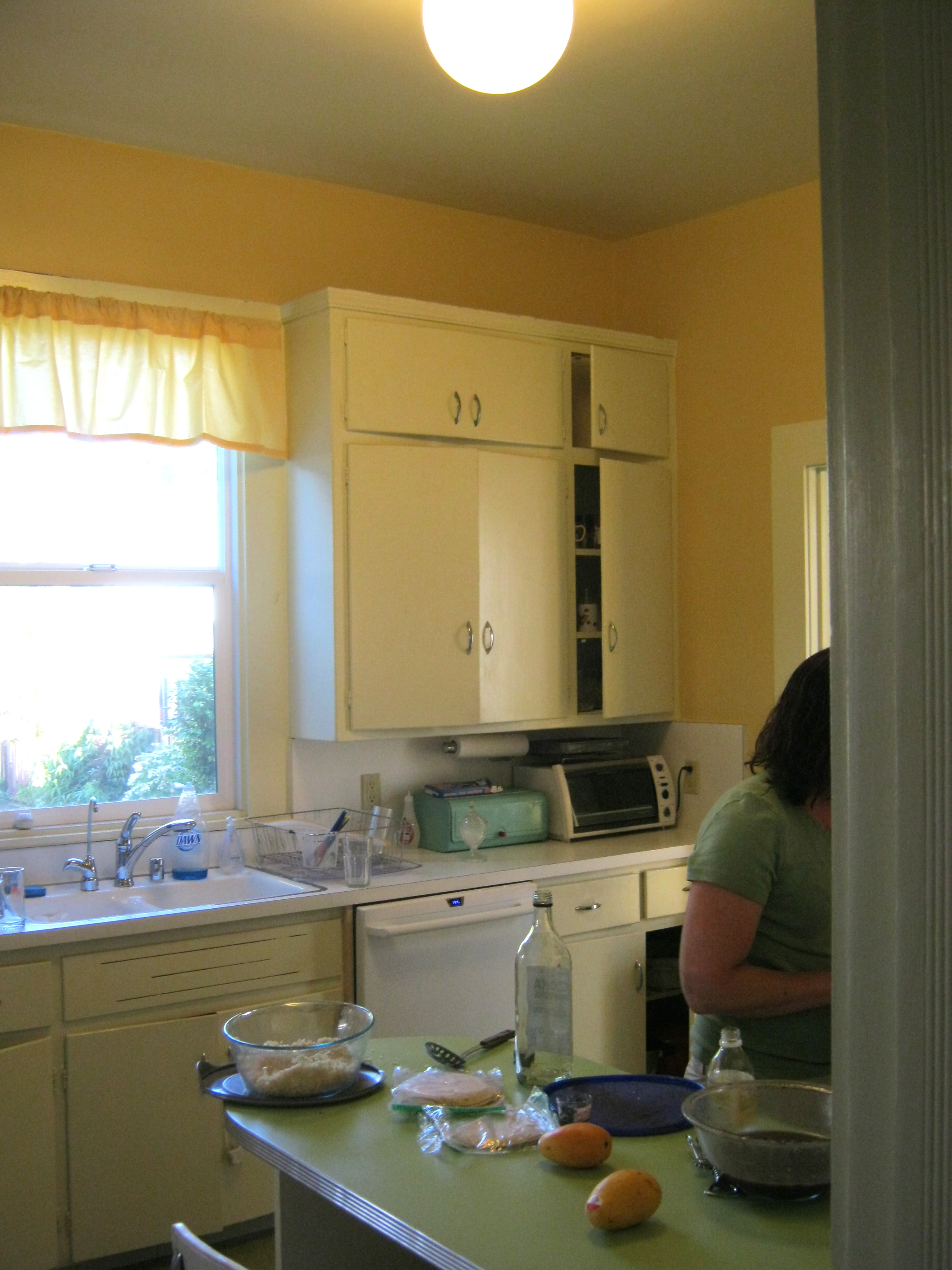
The lighting in the kitchen consisted of one big light in the middle. This used to be standard, but most people these days have a lot of different lights in their kitchens. I came to love this glowing orb. It is sort of like a sun shining in the middle of the room.
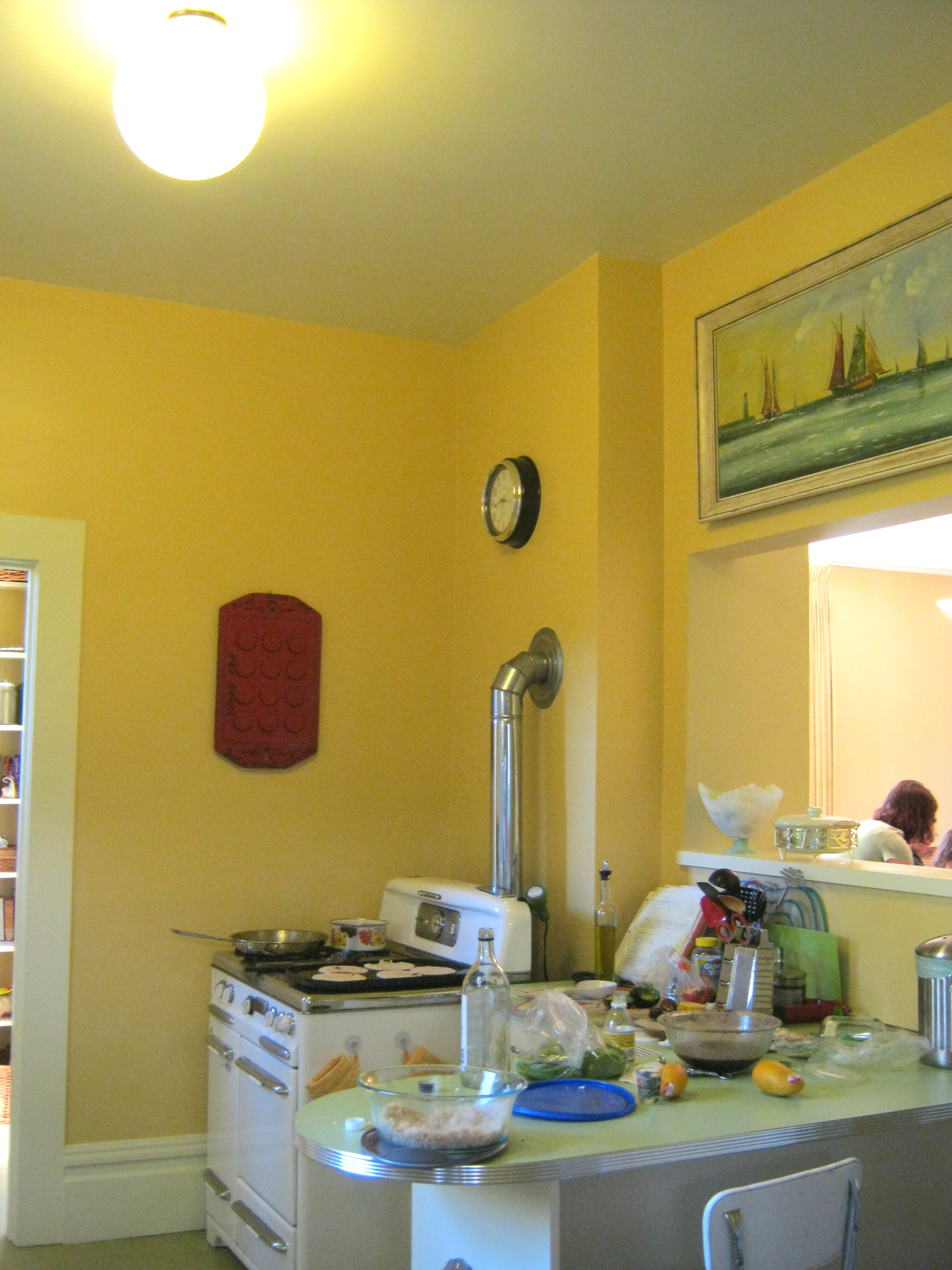
The Glowing Orb!
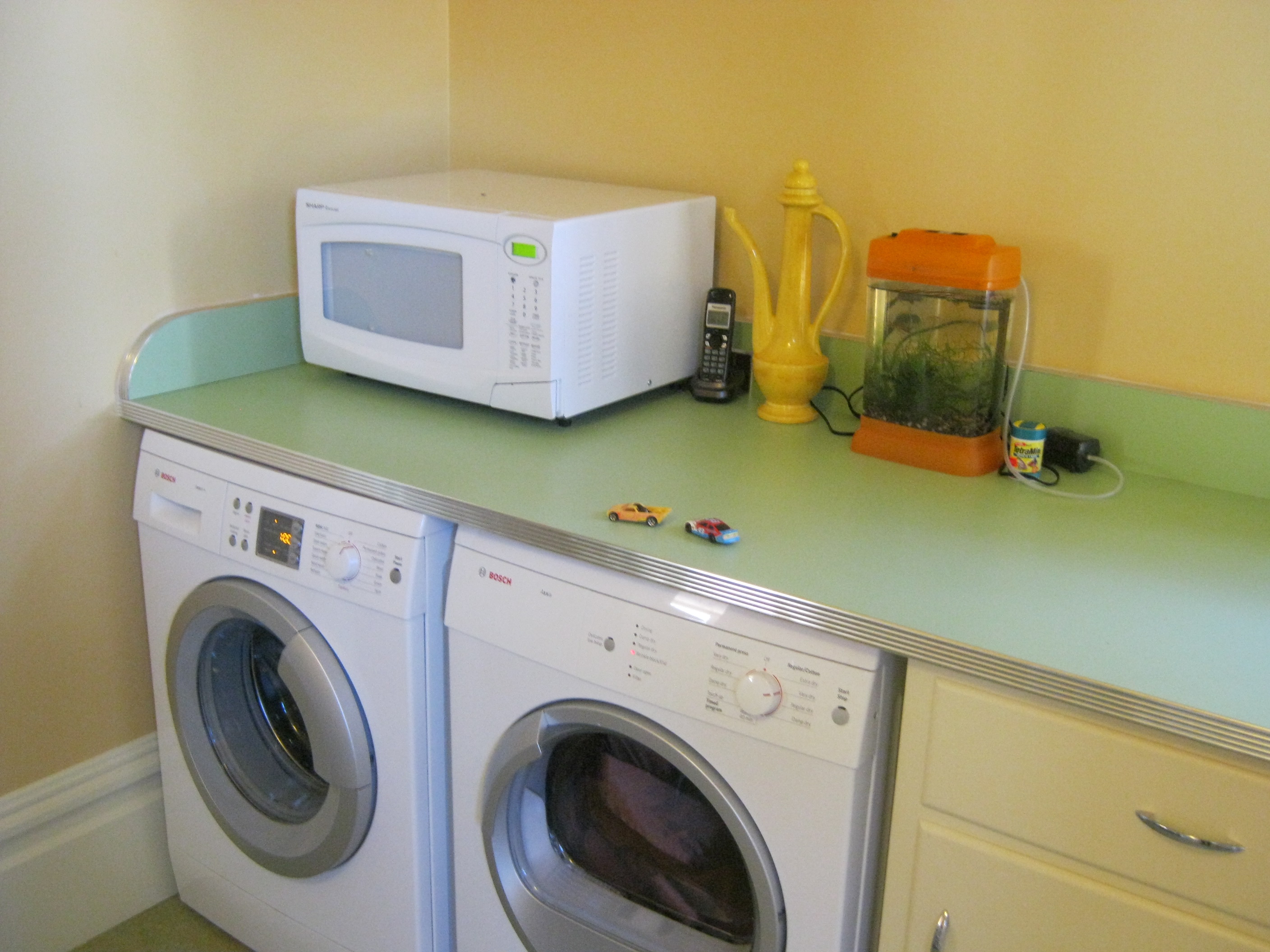
this is the laundry center…with folding counter on top
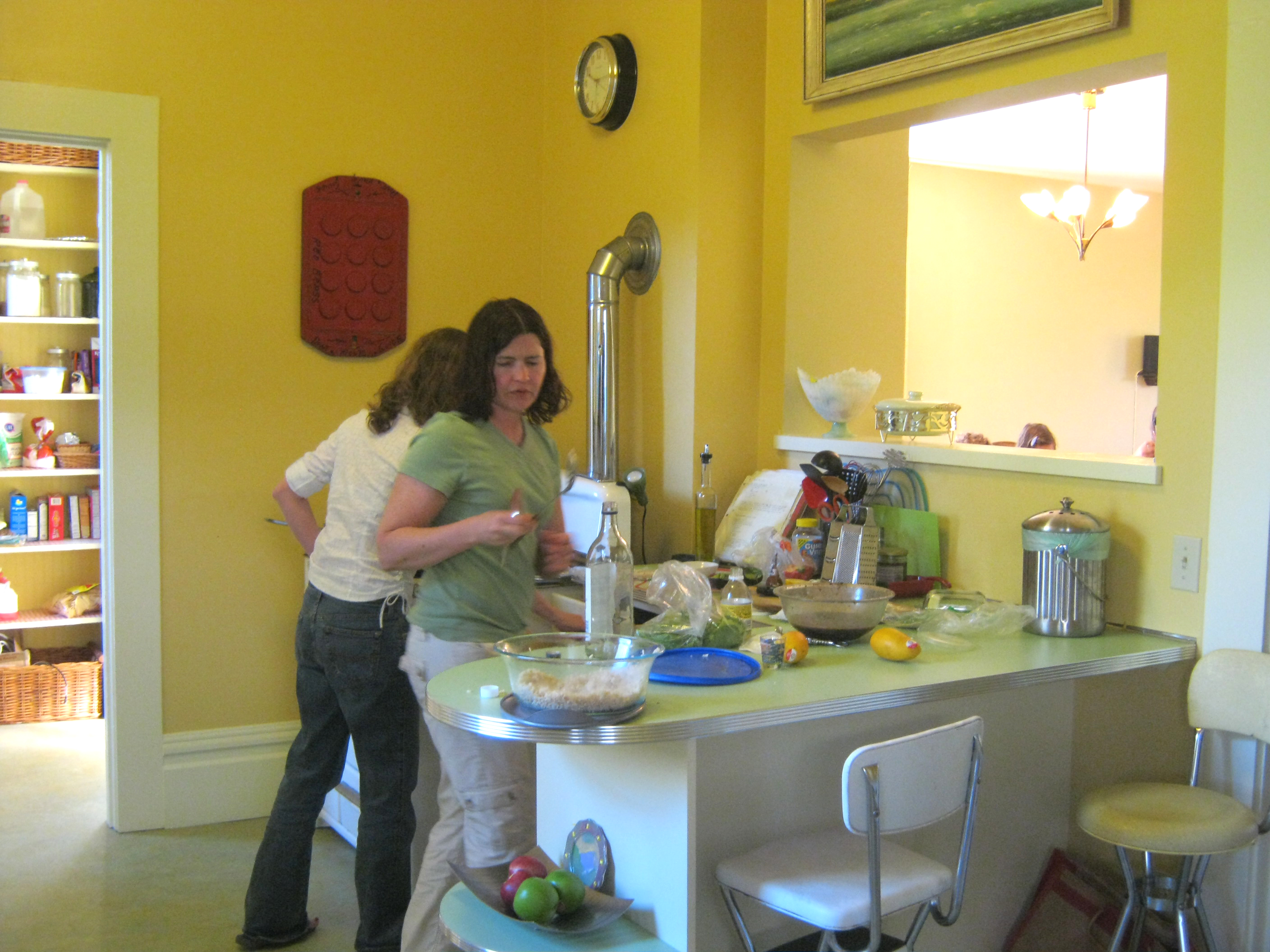
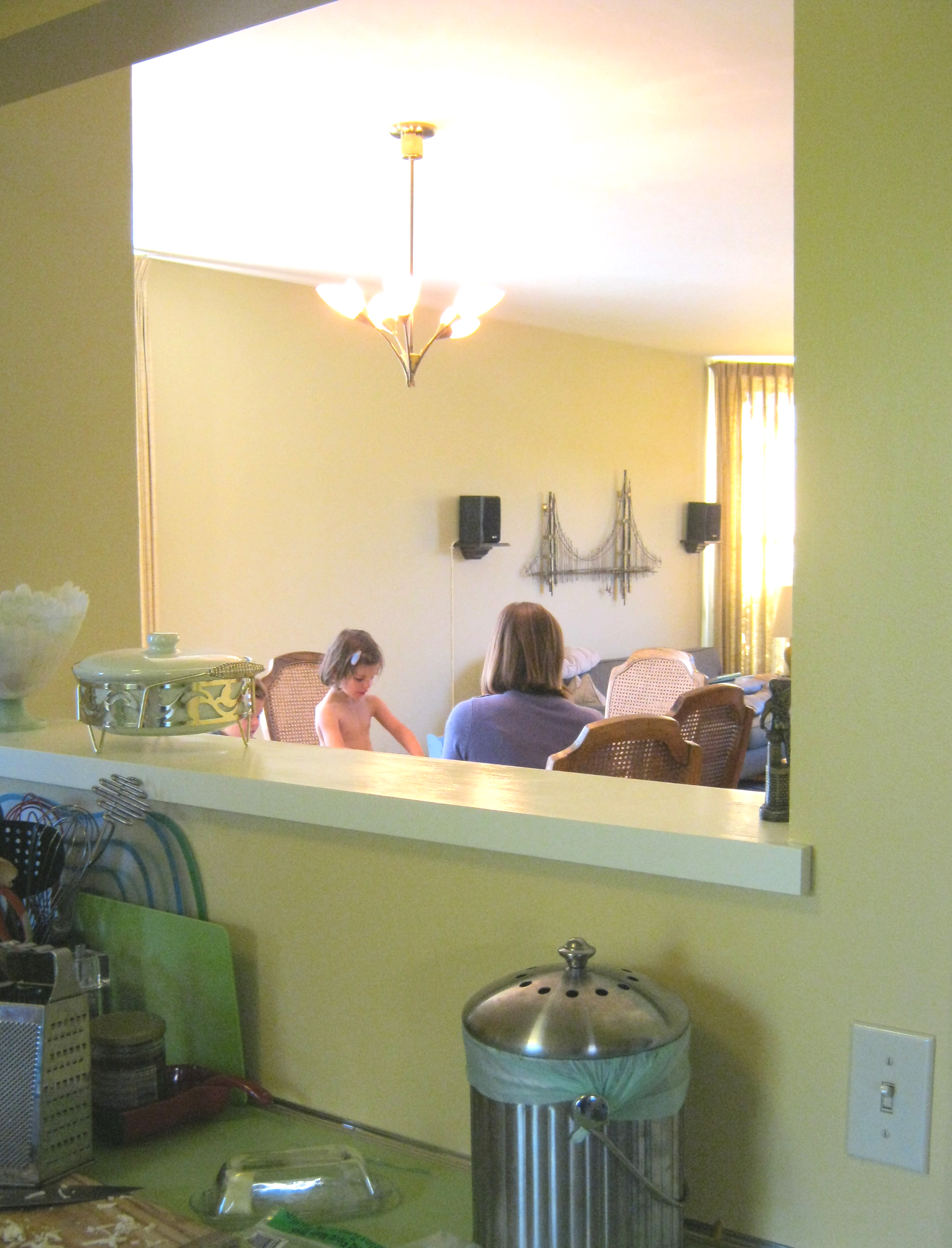
Another important feature came late in the design process. As was normal for 1898, the kitchen was walled off and disconnected from the rest of the house. The client didn’t think it was in their budget to make the changes necessary to rearrange the entire first floor, so we focused on making the kitchen nicer. Then we realized that it would be a pretty simple (low-cost) and easily reversible change to cut a window in the wall separating dining room and kitchen. This way food could be passed through and communication could happen without killing the formality of the dining room. Southern light from the kitchen window is an added feature in the dining room.
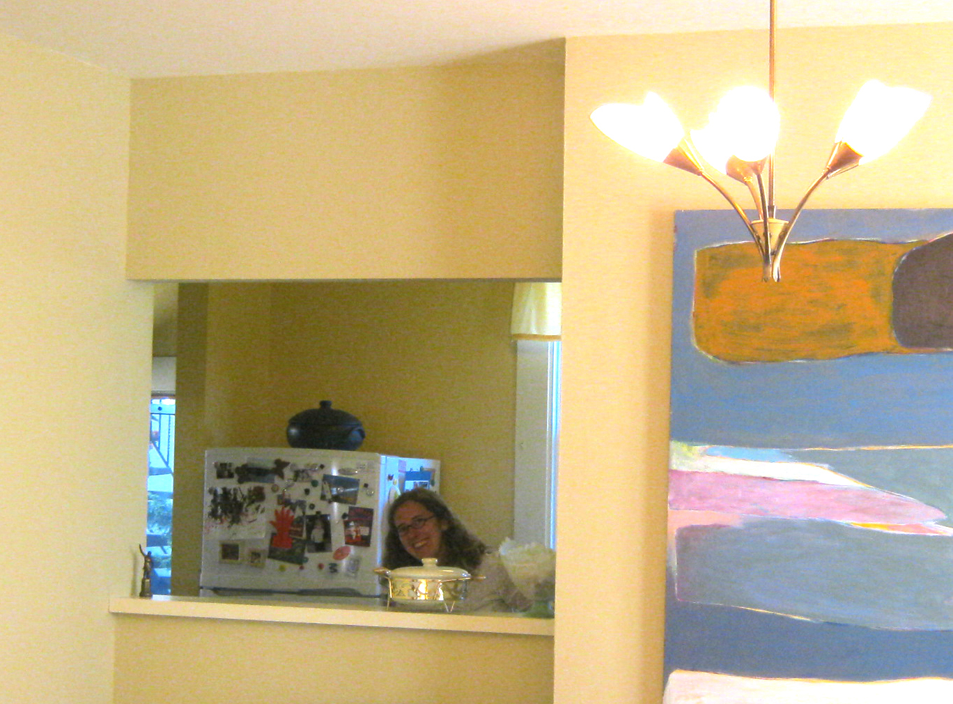
Happy client peeps through the new opening
Other features of affordability and style are the colorful plastic laminate counter tops with 50s style metal edge banding, the beautiful green Marmoleum floor (you’ll have to just believe me because you can’t really see it in the photos, & the open space for art that is available because the client didn’t squeeze in as many upper cabinets as they possibly could.
Of course keeping half of the old kitchen was a big cost savings. The new part looks different, but complimentary. Palimpsest architecture is the word for this sort of layering and leaving ghosts of the past rather than tearing out everything and starting over. . http://en.wikipedia.org/wiki/Palimpsest
Contractor: Guillaume Canivet
Cabinetmaker: Rusty Dobbs


