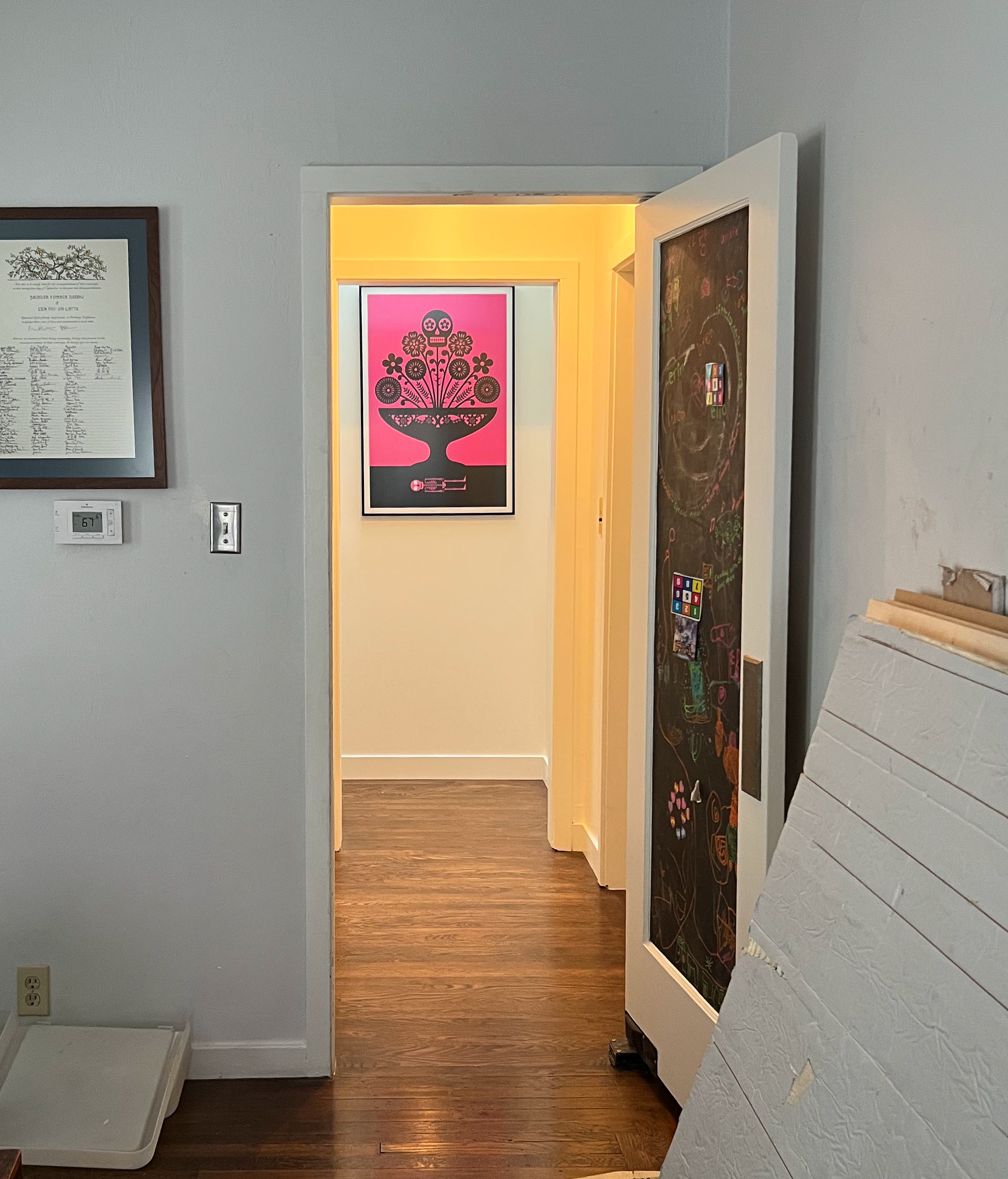
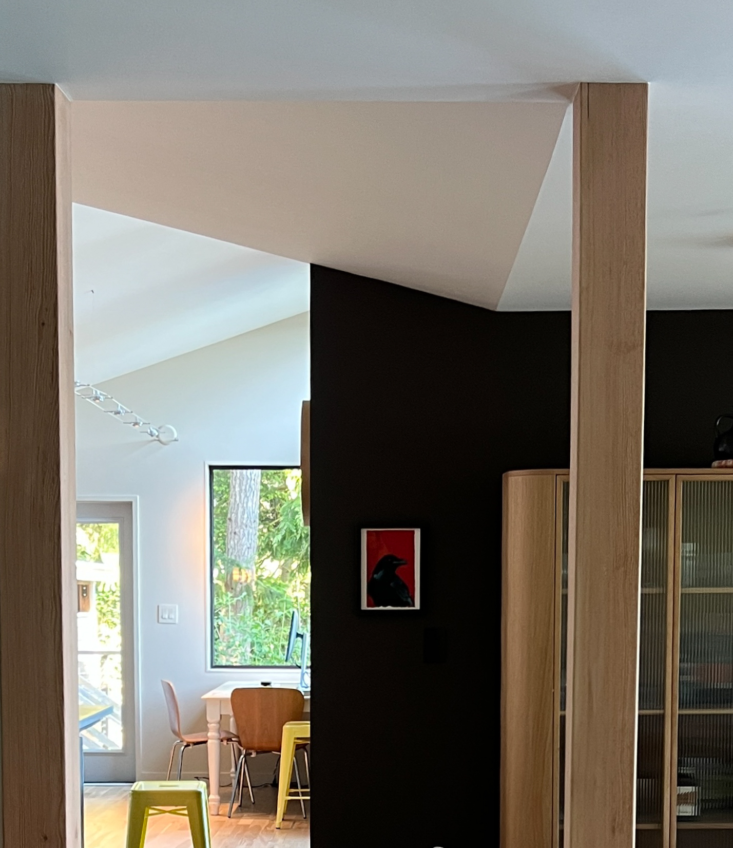
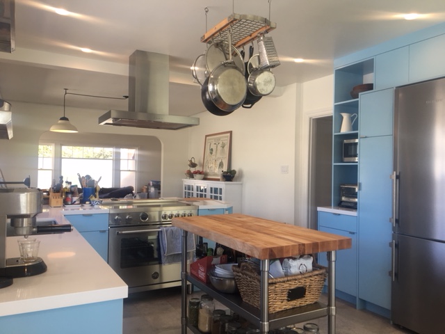
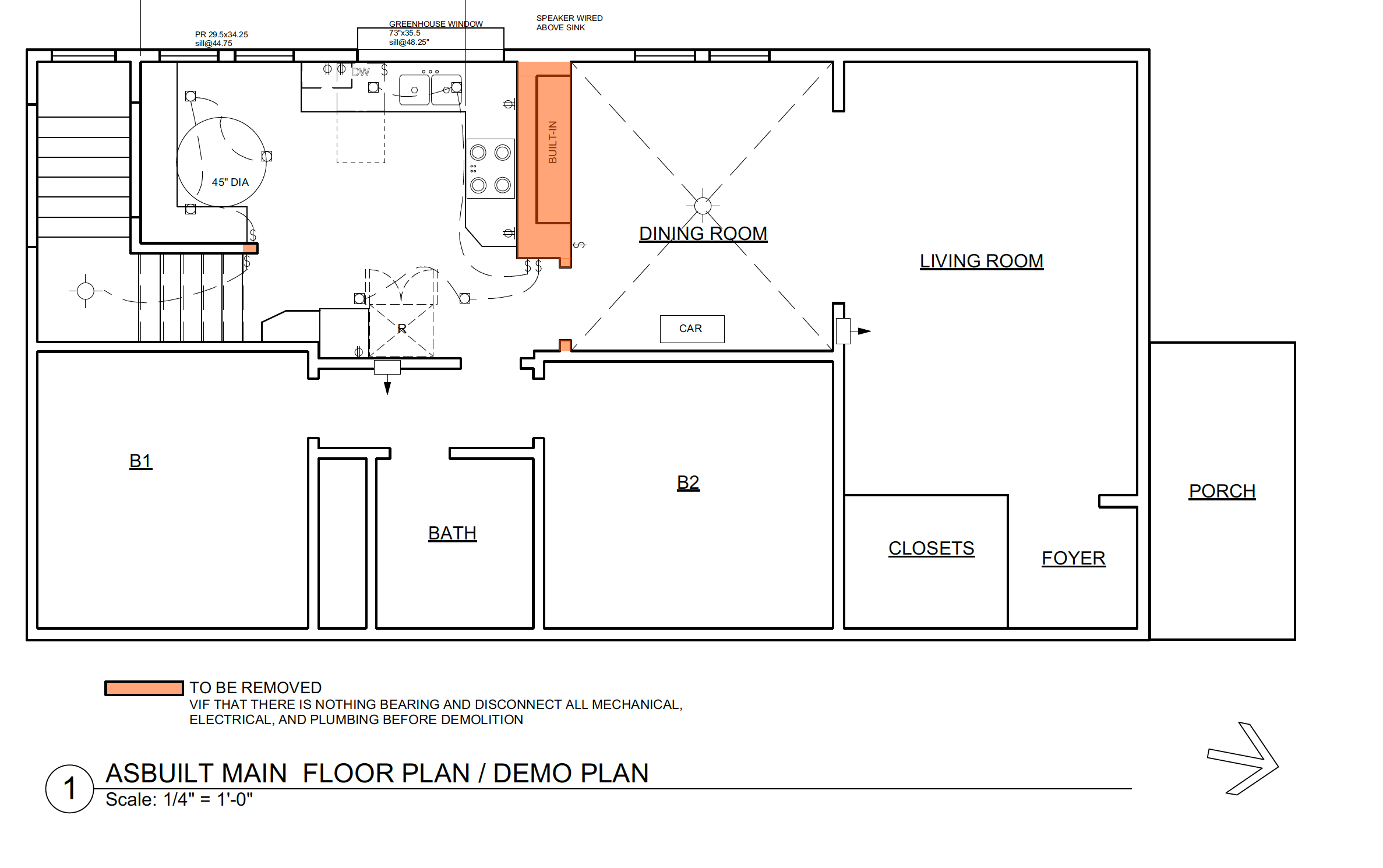
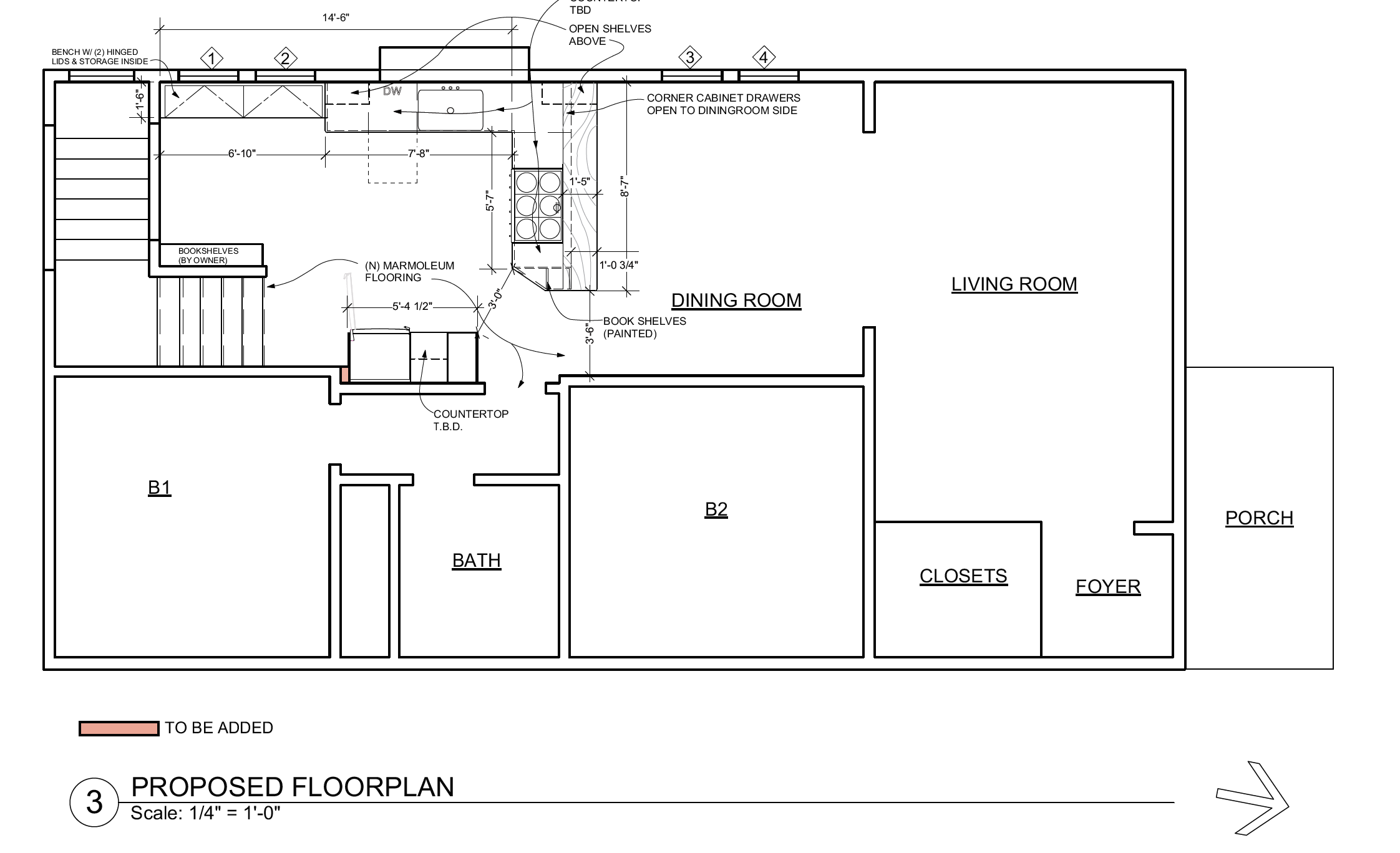
This was a very typical job here in Berkeley. So many older houses have strange, bad additions at the back of the house. Perhaps when they were built people still had garbage dumps in their backyards and had no interest in connecting their living space to the yard. These guys had a badly built 1950s era closet tacked on to the back of their kitchen that contained the laundry and a bunch of other stuff. We moved the laundry and all the storage to the middle of the house and moved the kitchen to the back, adding a dining nook and a half bath and a very small extension to the back bedroom.
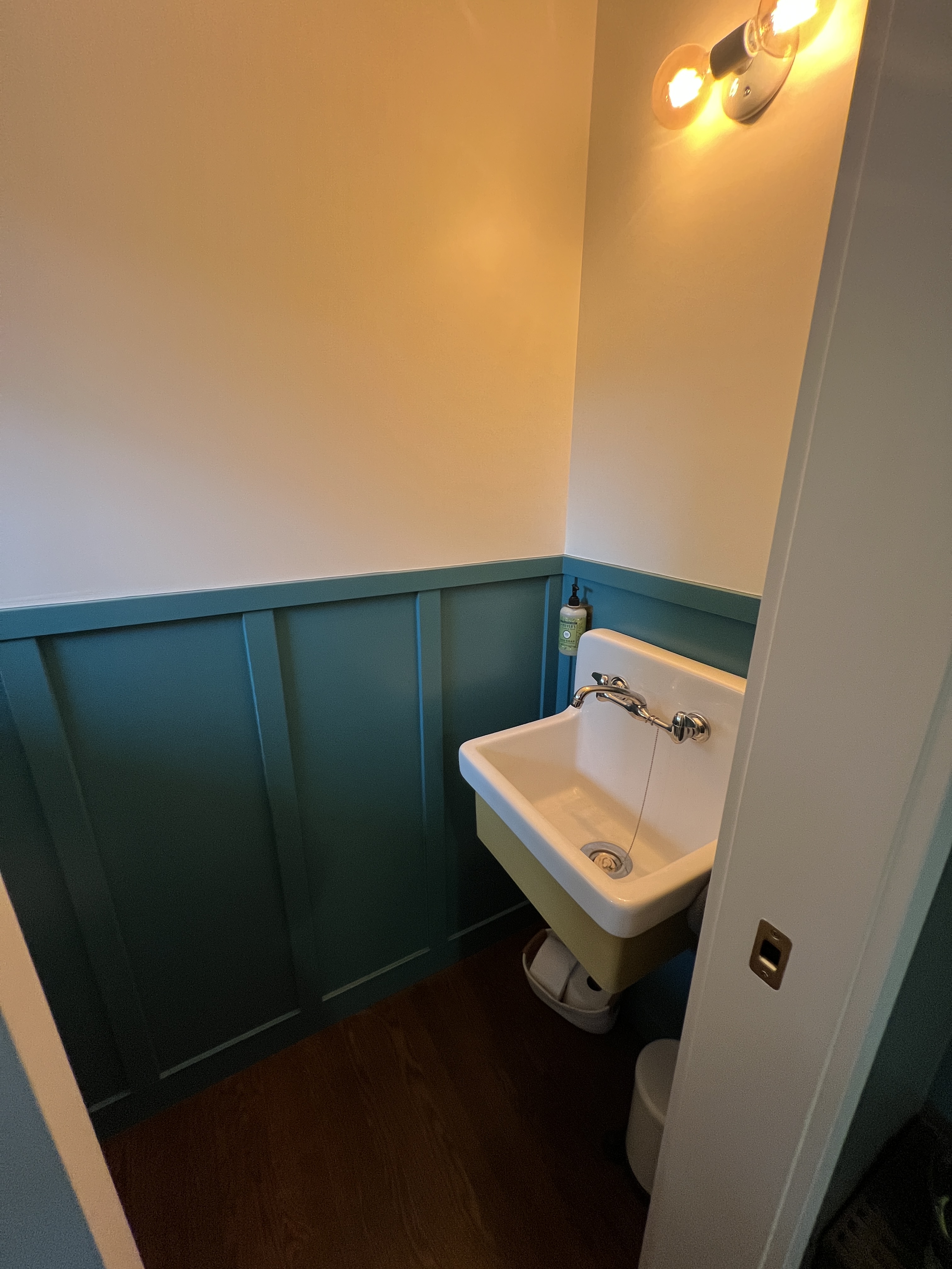
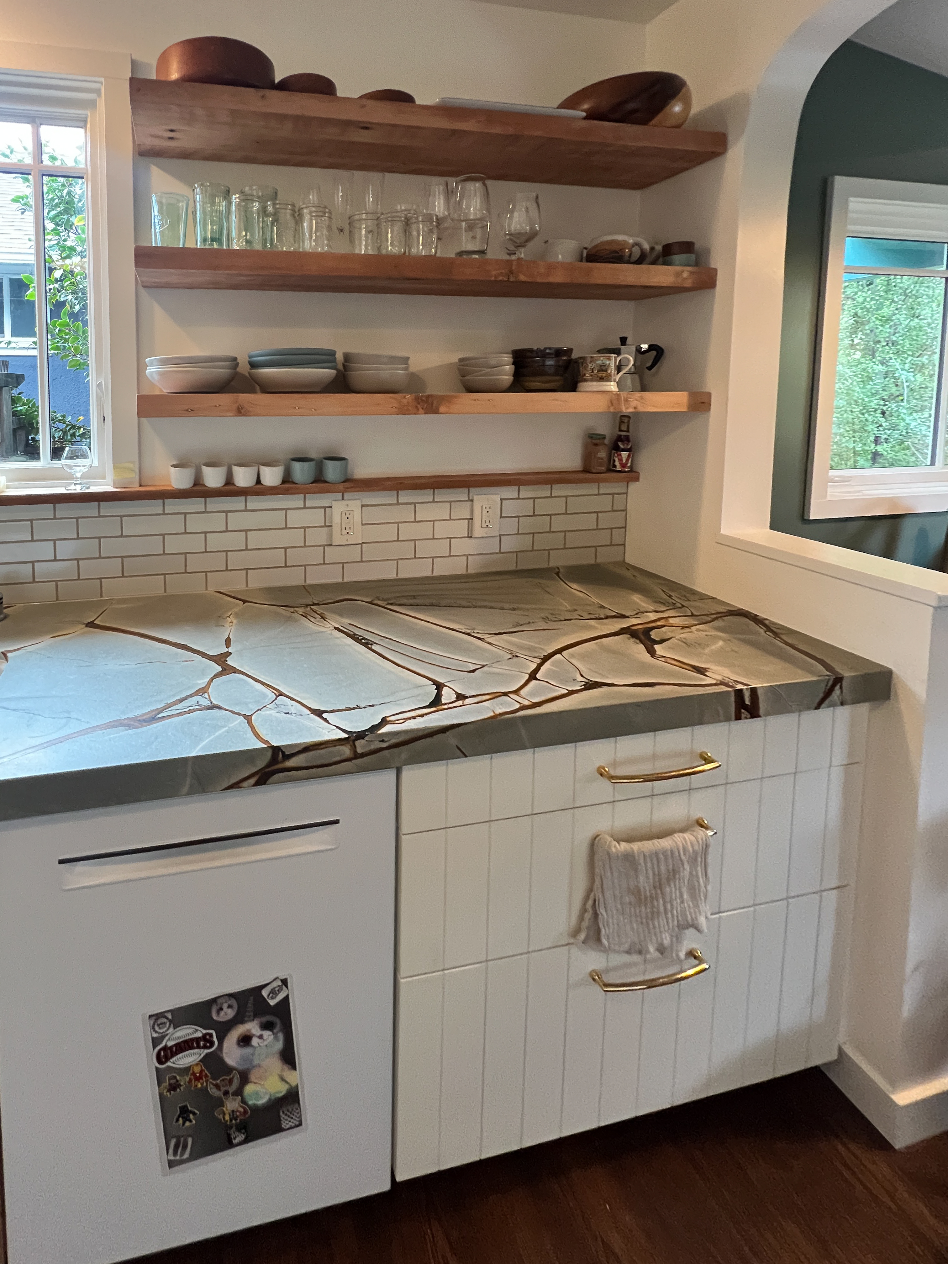
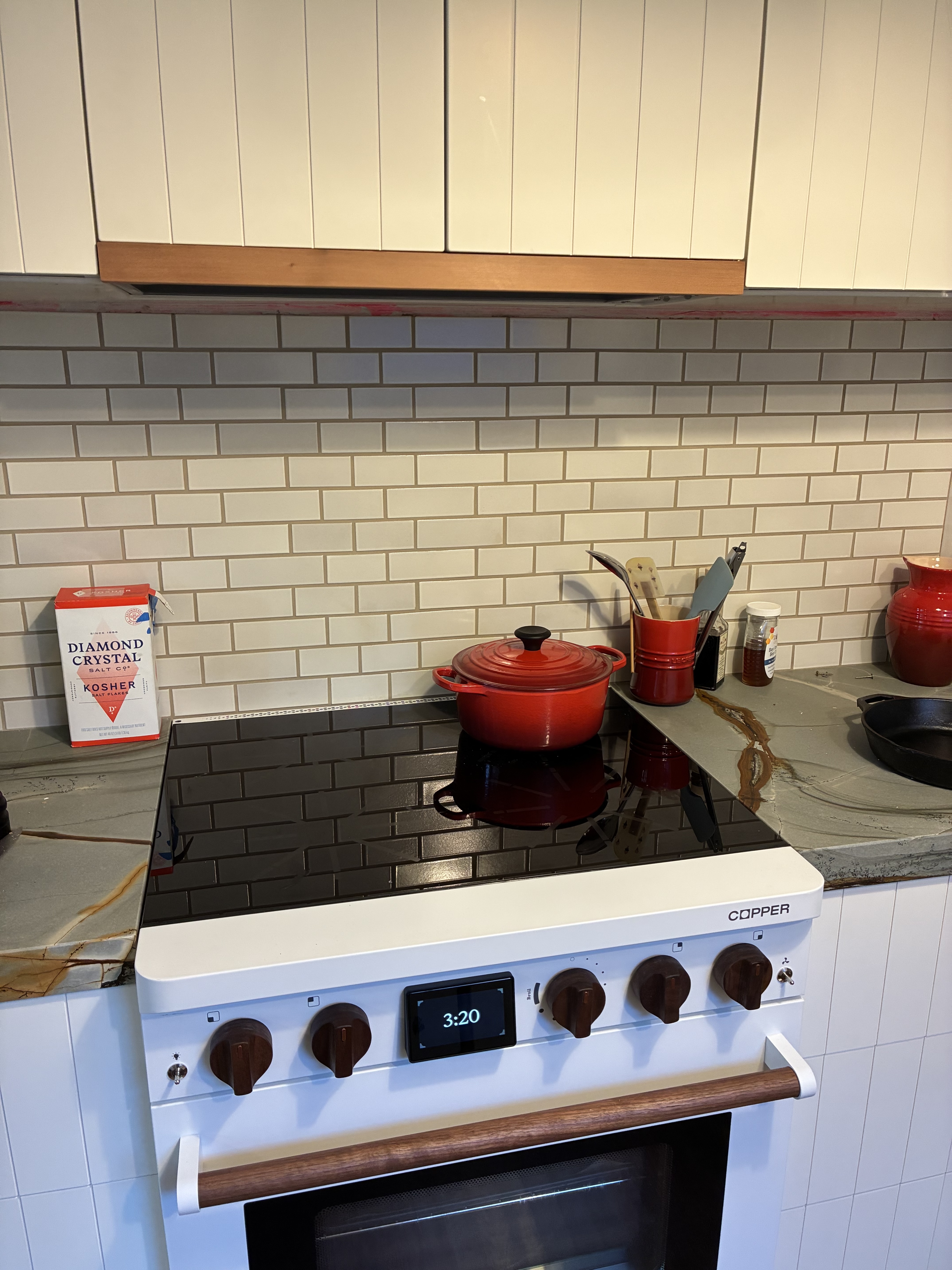
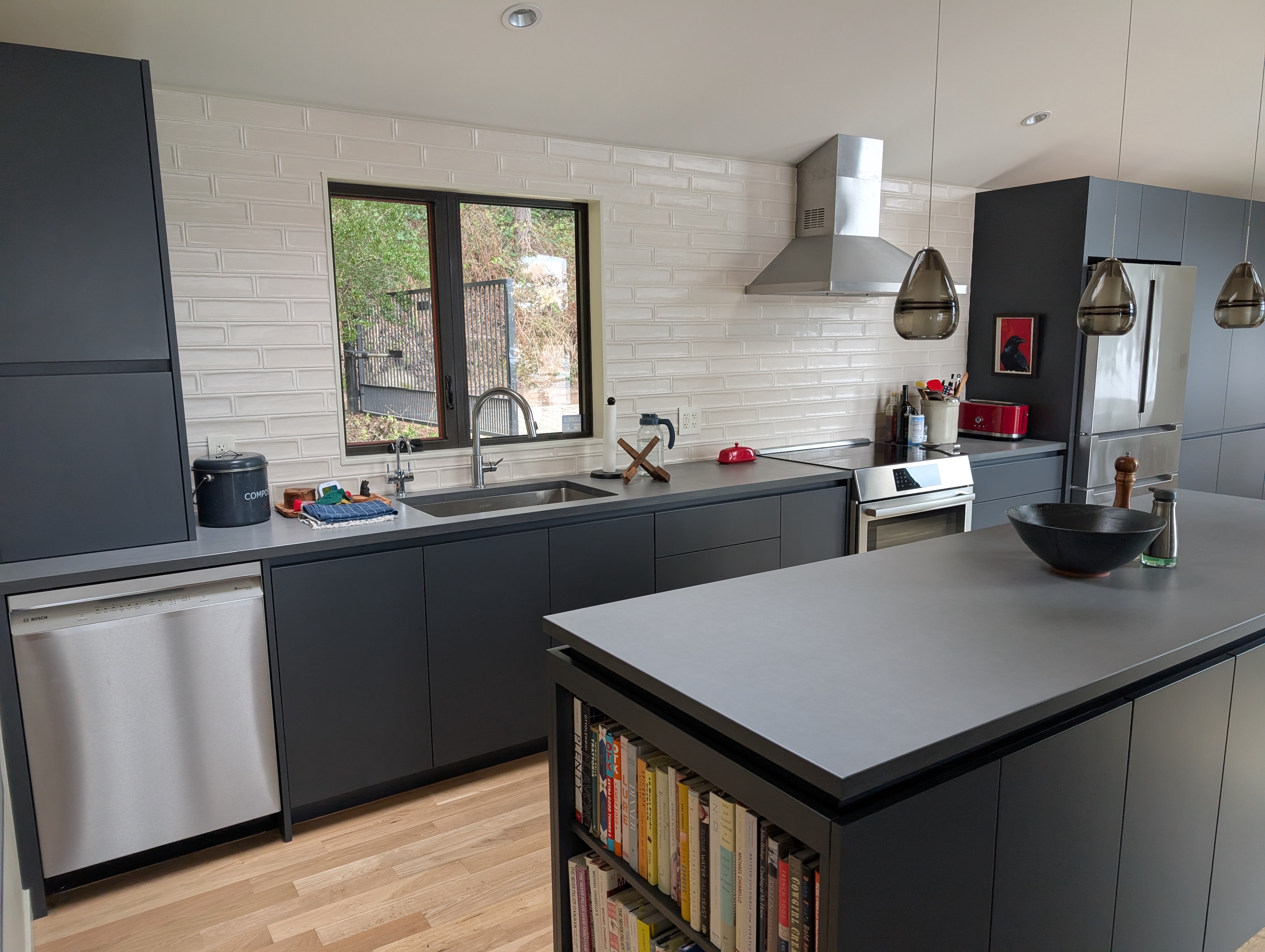
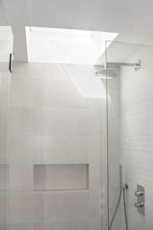
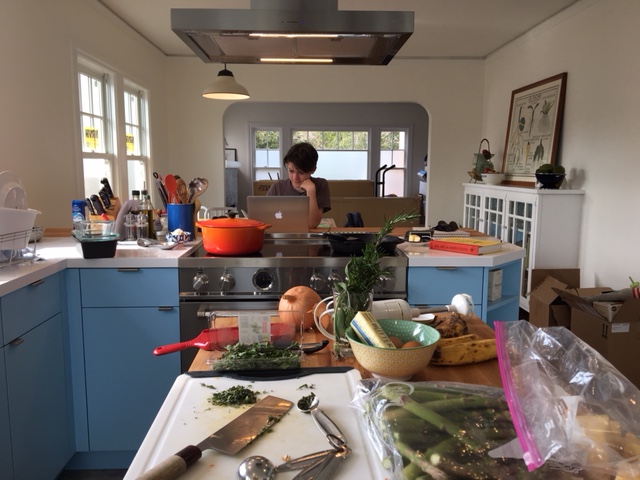
This is a view from the dining room towards the laundry and kitchen. A skylight over a piece of art beckons you to walk that way. new half bath with utility sink, reuse of the old chicago kitchen sink faucetThe owner built this nice shelving out of salvaged fir and we extended the window sill into a little shelf over the tile.Copper induction range with a built-in battery. (Berkeley company.)SANCO₂ heat pump hot water heater (tank inside, heatpump outside) that doubles as house heating system (Harvest System)
The owner is still finishing up details like the nook and the pantry so I will hopefully have one more update on this project.
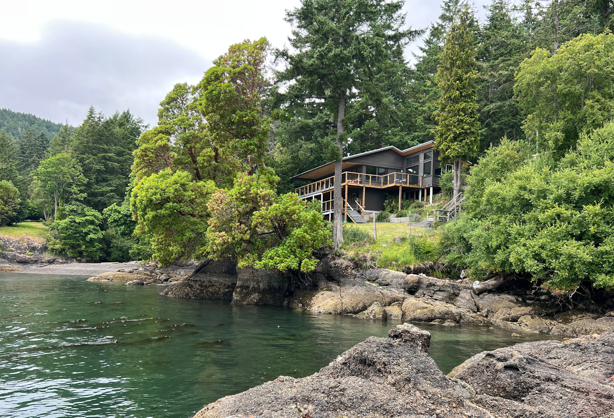
My client for a remodel of a 1960s house on Galiano Island invited my family up to see the almost finished house. (a few details and exterior paint not finished yet)
The location is truly spectacular and I was very happy with the improvements that we made. Improvements included: on the practical side: tightening up the exterior envelope (including new fibercement rainscreen siding, all new windows, & insulation), upgrading to an energy efficient heating system, and adding a HRV, and then rearranging the interior extensively to simplifying and improve the transitions between spaces. The lower level was majorly improved, but it was a pretty straight forward rearrangement breaking it up into more usable rooms, guest suite, familyroom, office and storage. I didn’t include those photos.
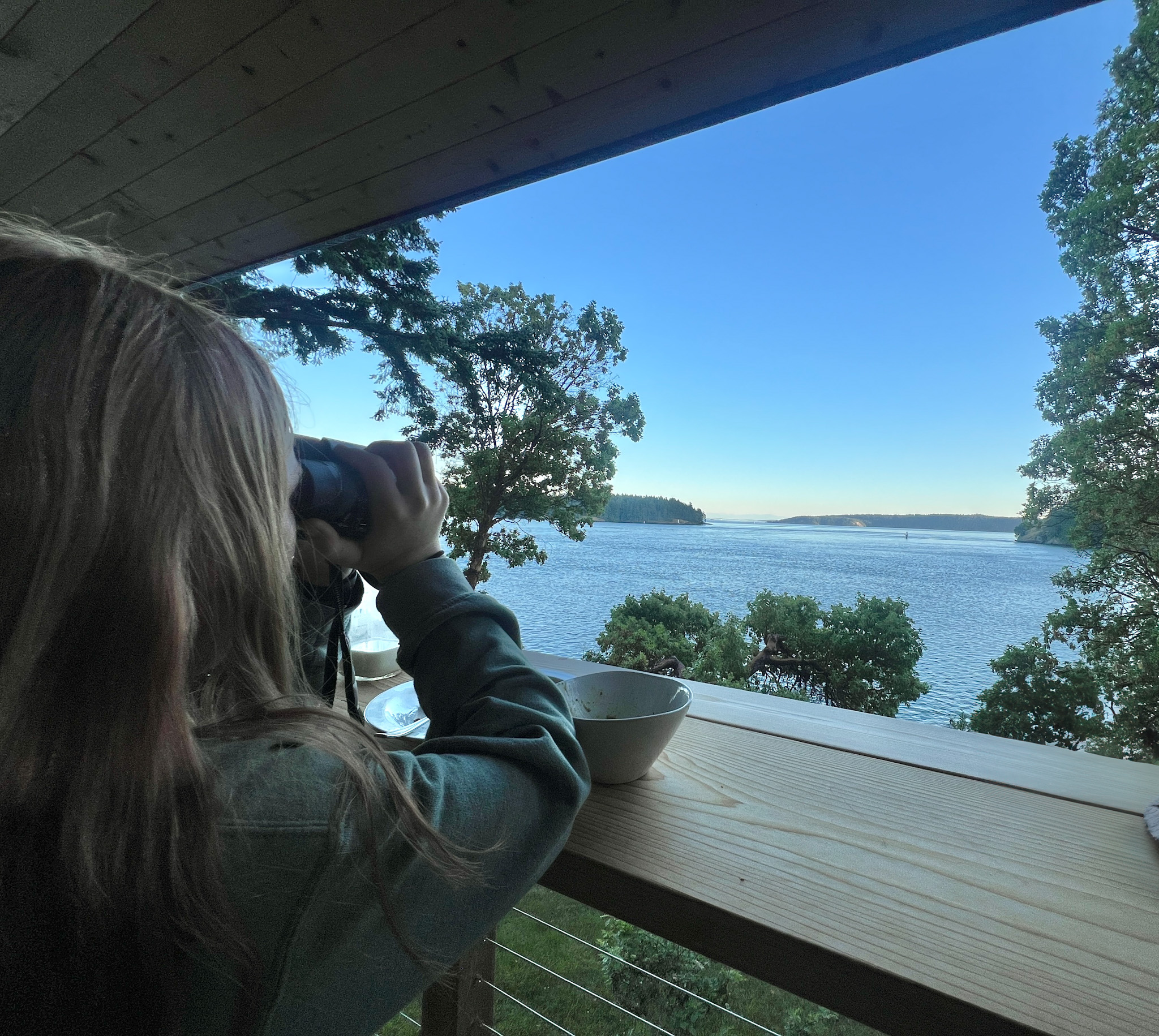
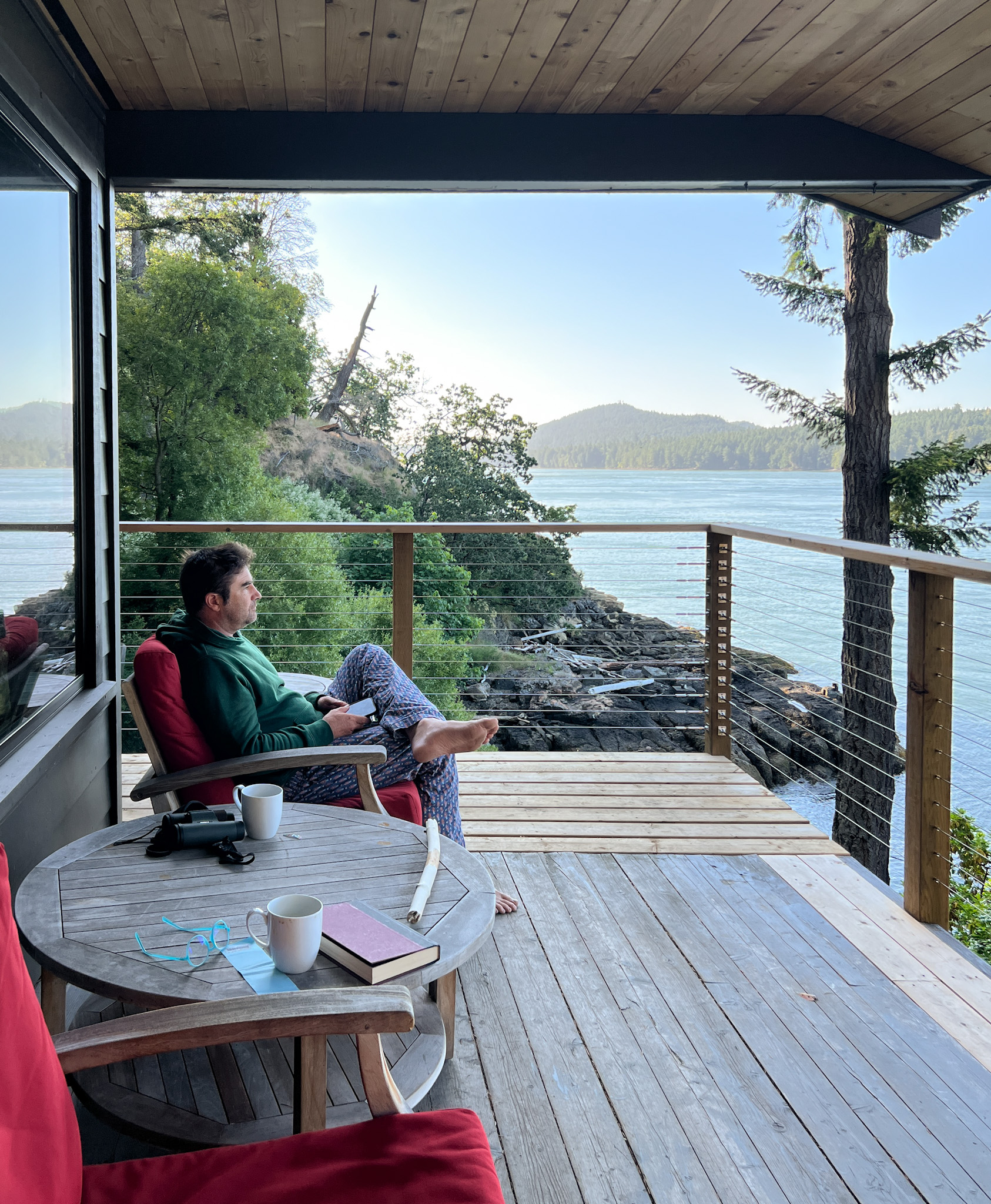
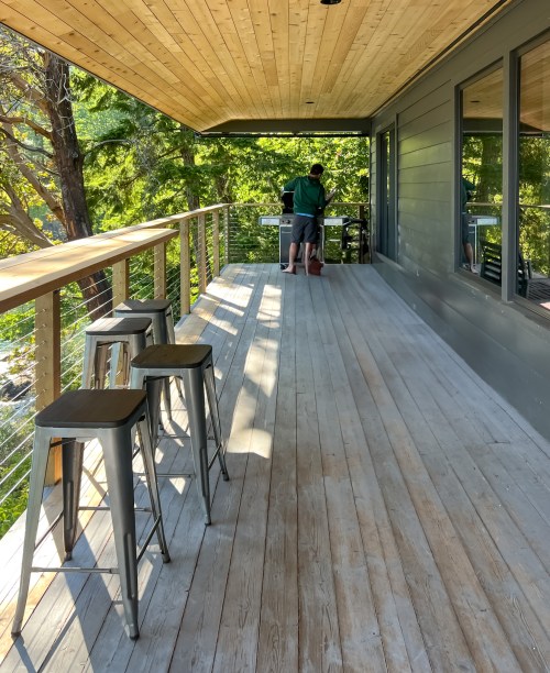
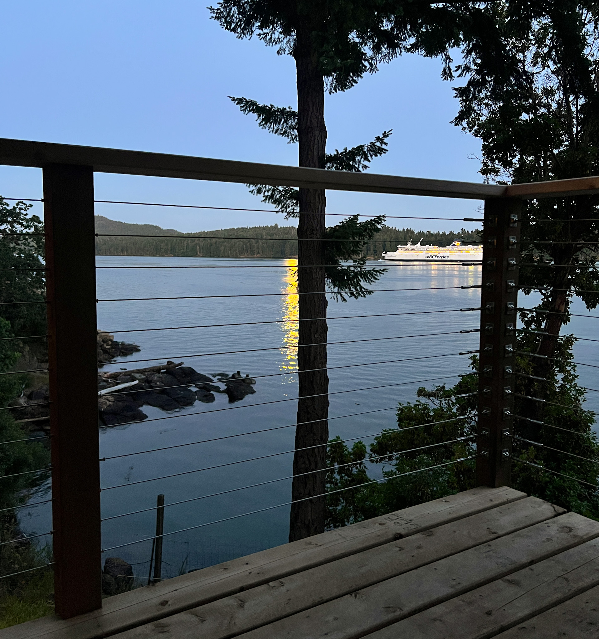
The main event is the view to the south to Active Pass and all the way to the Olympic National Park 70 miles to the south. We spent many hours enjoying the view of wildlife and boats from the covered porch.
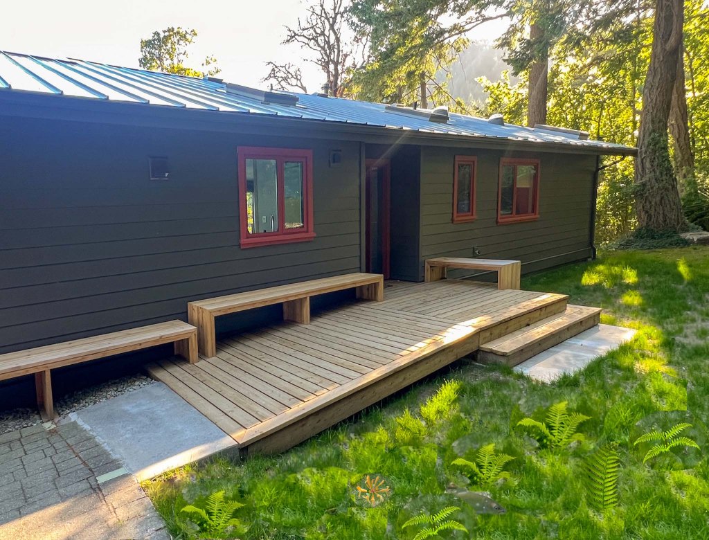
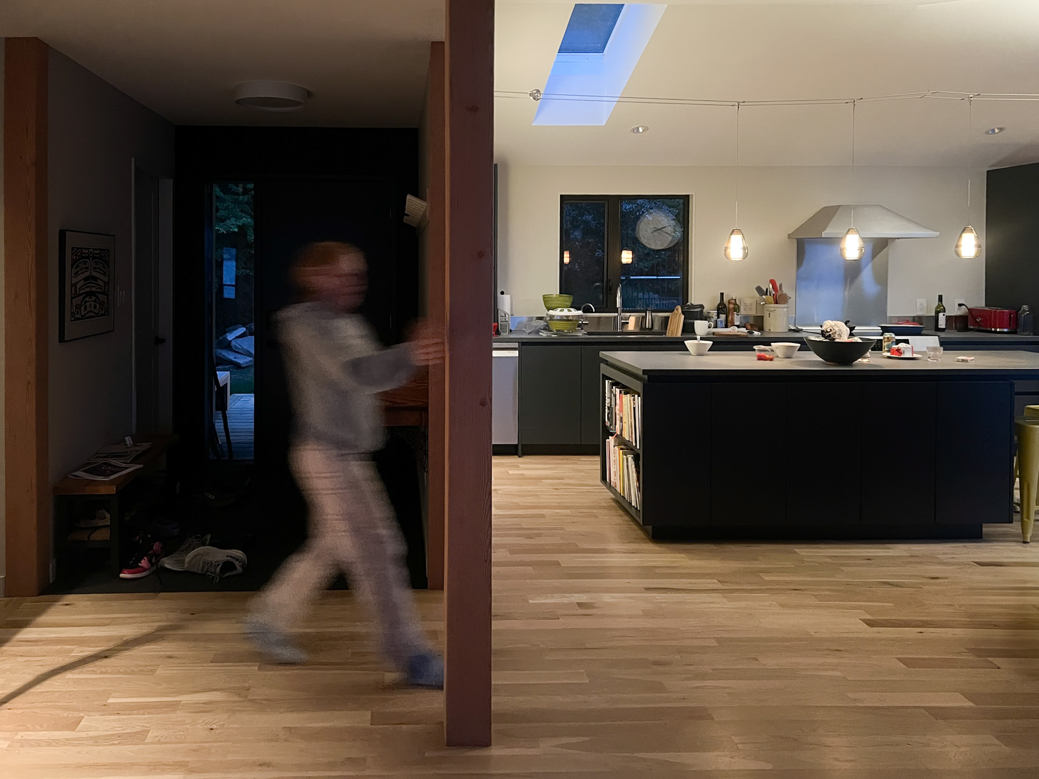
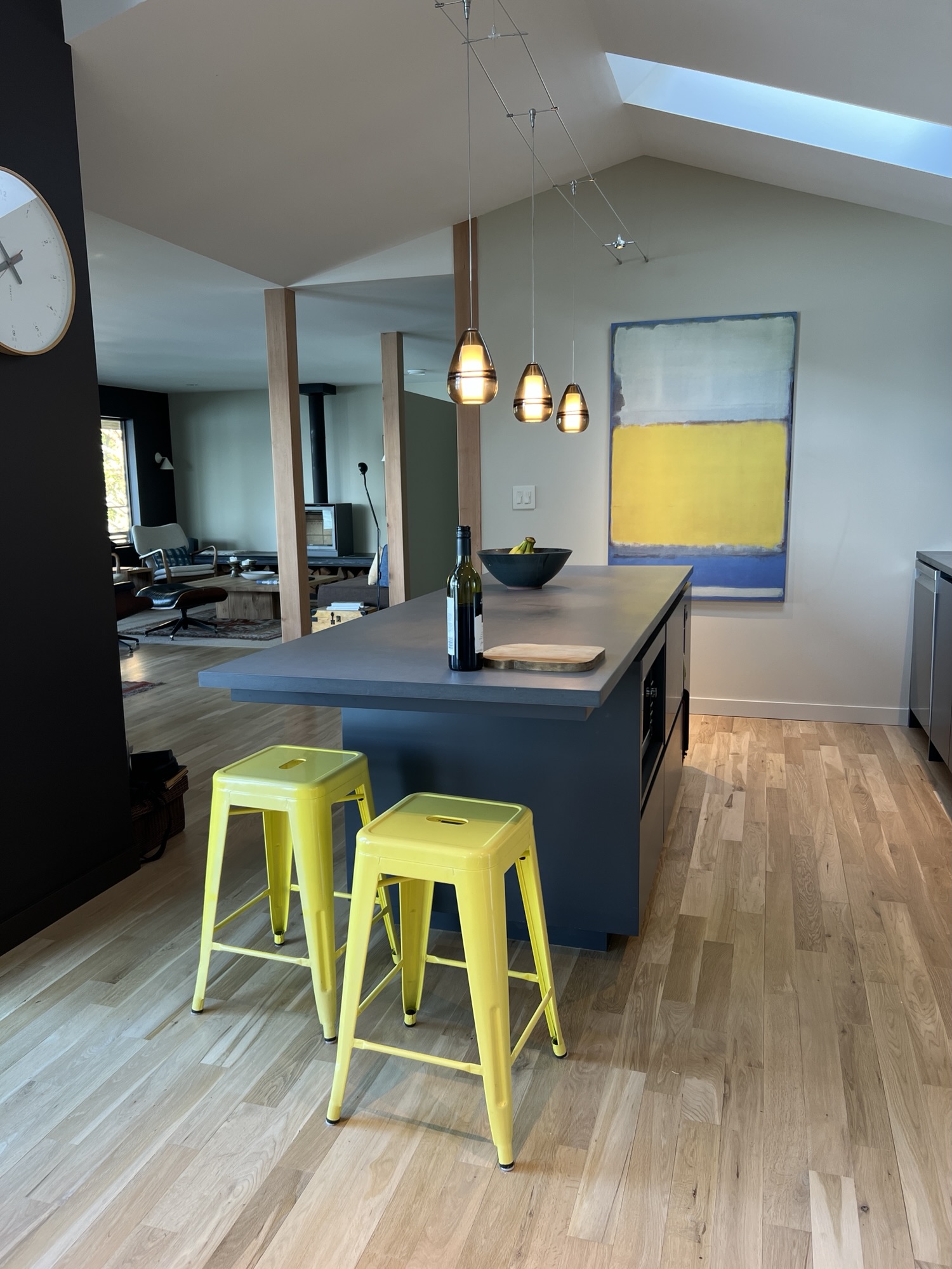
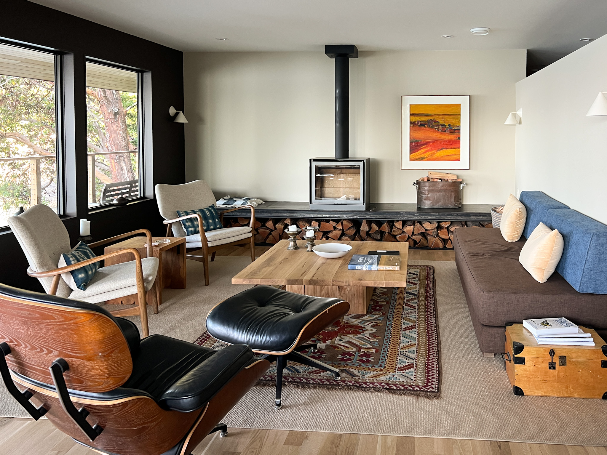
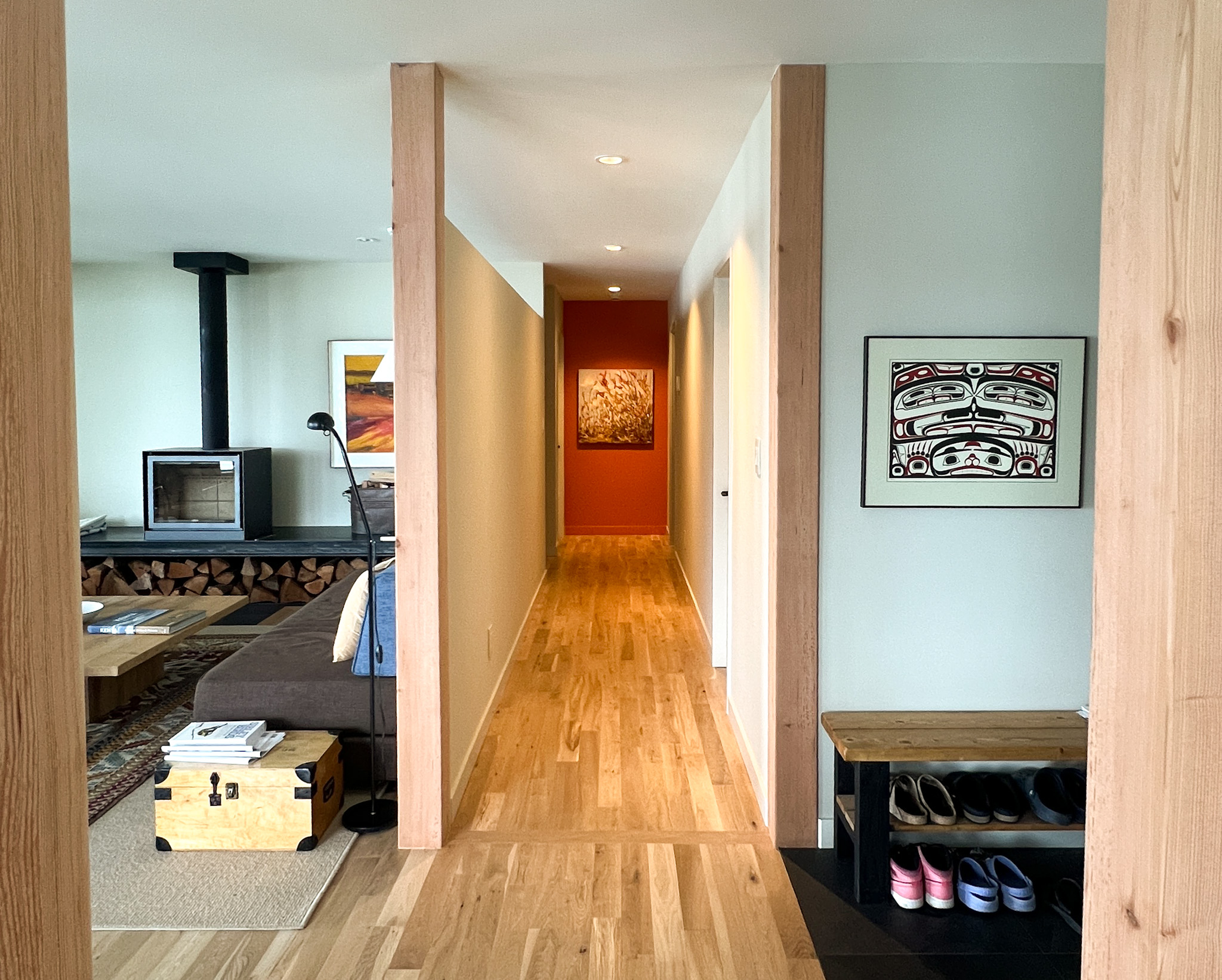
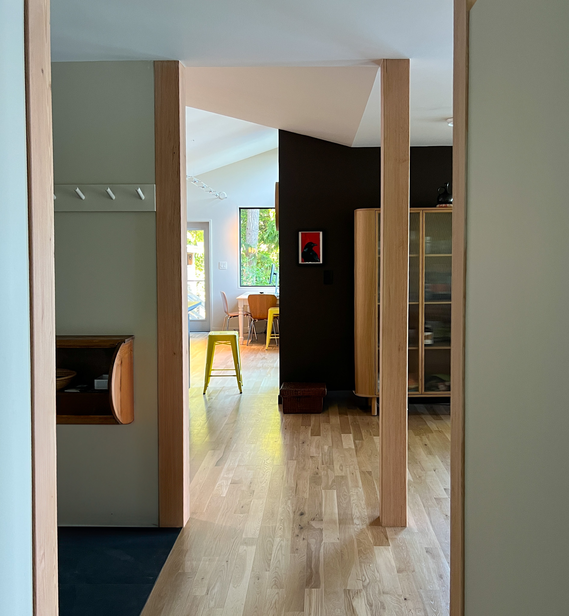
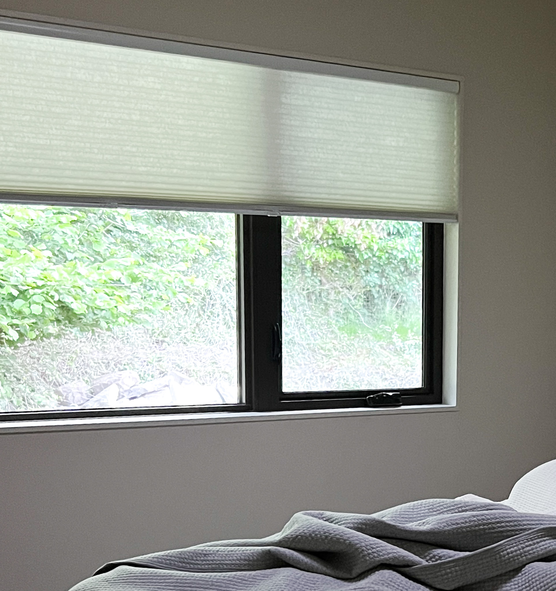
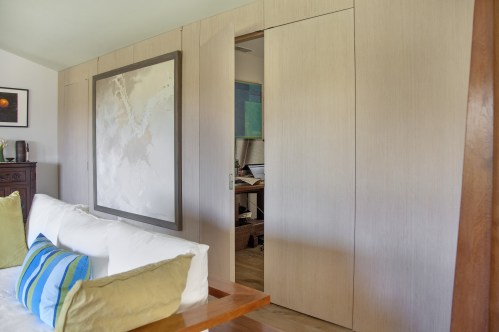
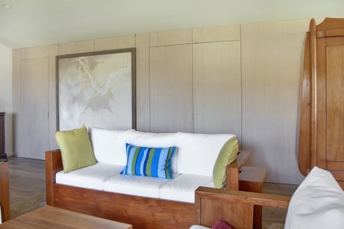
View of the house from the water. we simplified the roofline and deckView from the gate – Red windows and trim on this side to give it some personality from the road. New cedar entry porch with benches was a big improvement for easy access for all. (Old one had uneven stone steps down from driveway then back up several steps to the porch.) (I & AI added the ferns to the photo in the foreground, and strangely also a fish amongst the ferns) enjoying the viewBC Ferry Salish Heron with Mayne Island, Prevost Island, Pender Island, and The Olympics beyondEnjoying the viewLong south side covered porch. We eliminated the non structural posts that went to the roof and did not miss them despite my concerns that it might look odd without some posts. Enjoying the fir postkitchen transition to living and dining room – vaulted ceiling to flat ceiling. This was a tricky structural bit for the builder because he had to modify the existing trusses and I am thankful that the owners saw the value in making the transition what it should be rather than the easiest way. Kitchen counters are Paperstone – made from recycled paper and both warm to the touch and acoustically dampening. Livingroom – My favorite detail is the steel beam supporting the wood stove shelflooking downtown the bedroom hallway – we made it more private but kept a slot at the top of the wall to let light through. Aimable recessed light at the end illuminates a painting. Looking past entry toward kitchen – ceiling transition and four fir posts creating an elegant transitionmoonlight and ferryInterior window detail – painted wood jamb on all 4 sides. Another view of the window detailRelocated stairs to the lower level. (Old ones were in the prime real estate between kitchen and dining room.)Owner jsut sent me an updated photo of the kitchen with the tiled backsplash finished. Looks great!
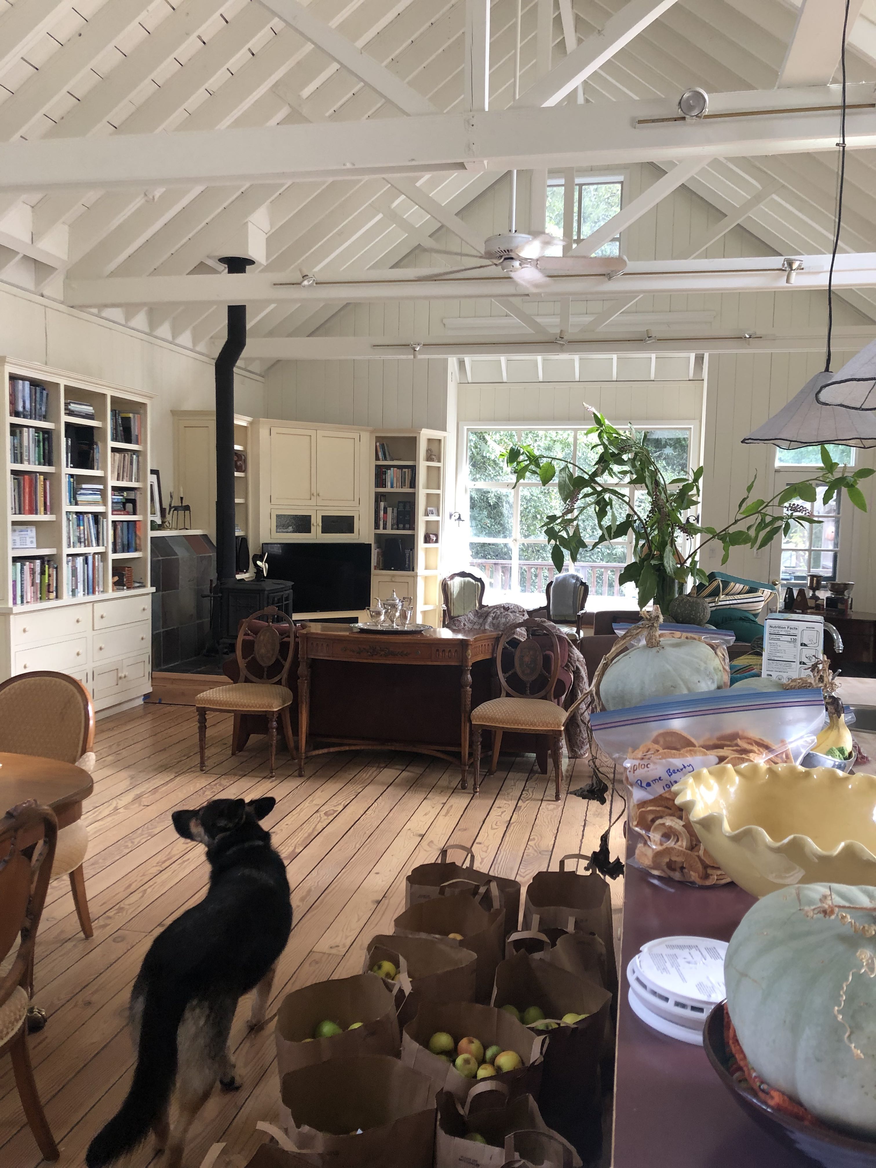
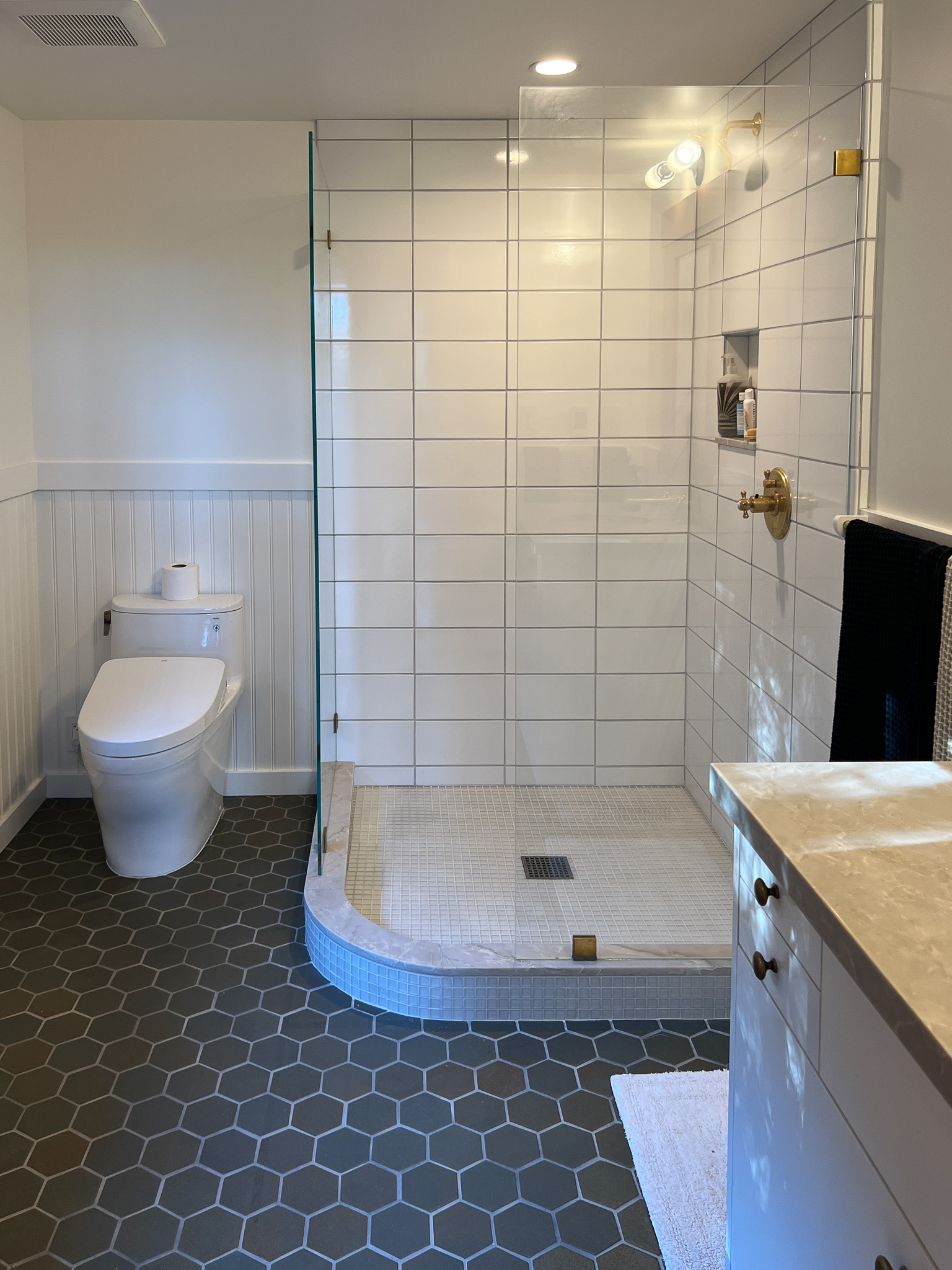
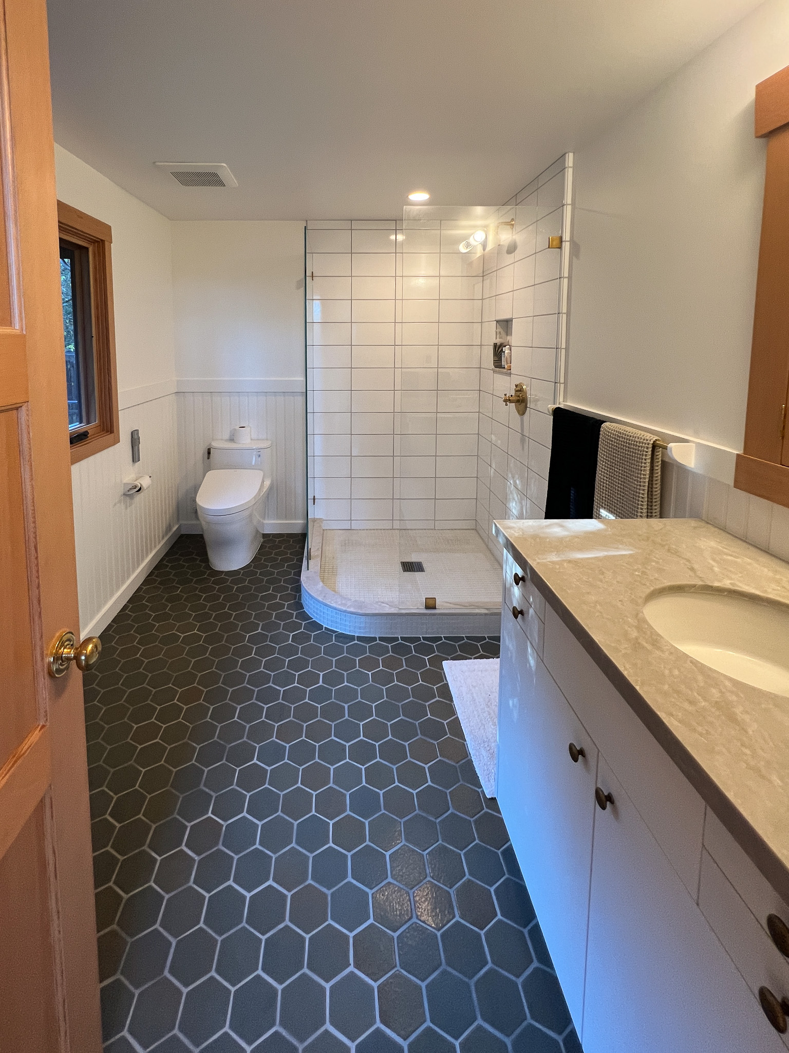
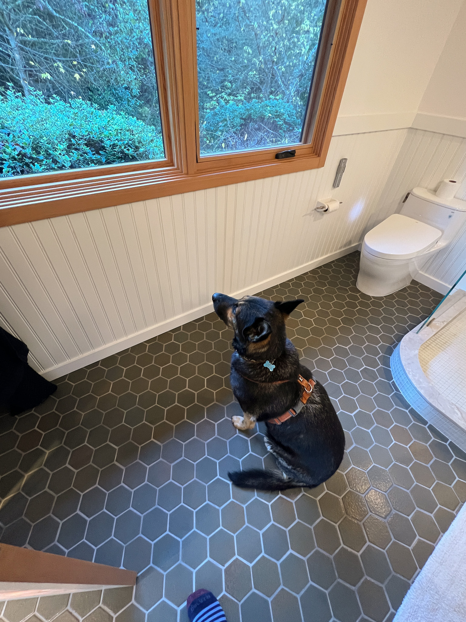
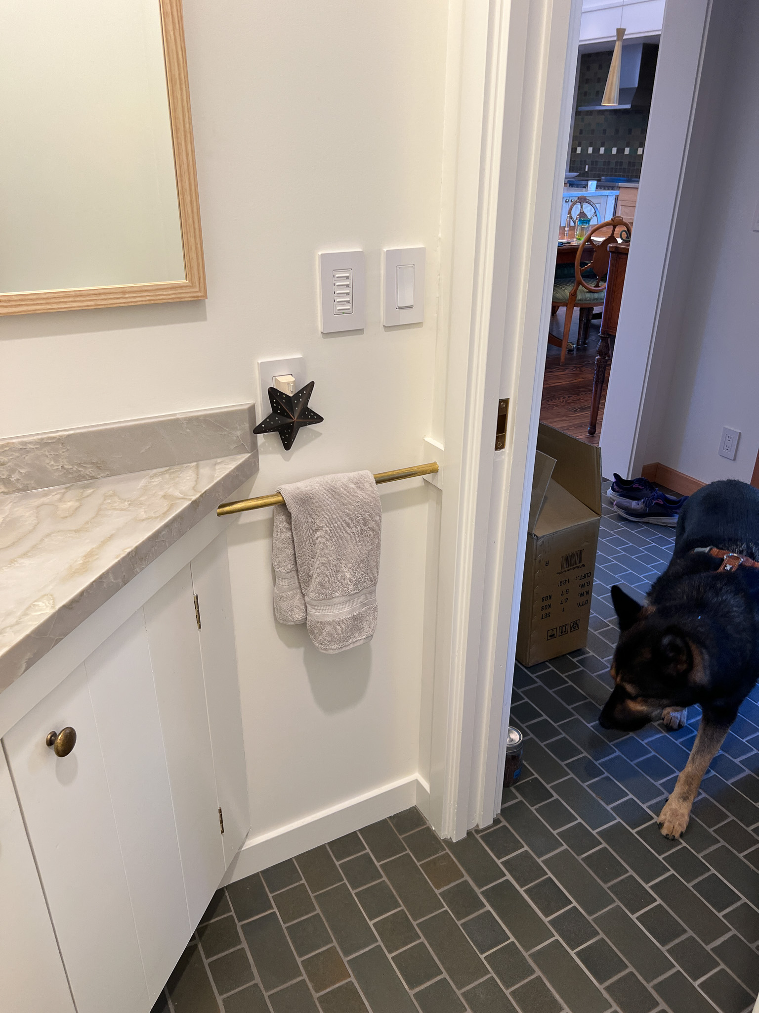
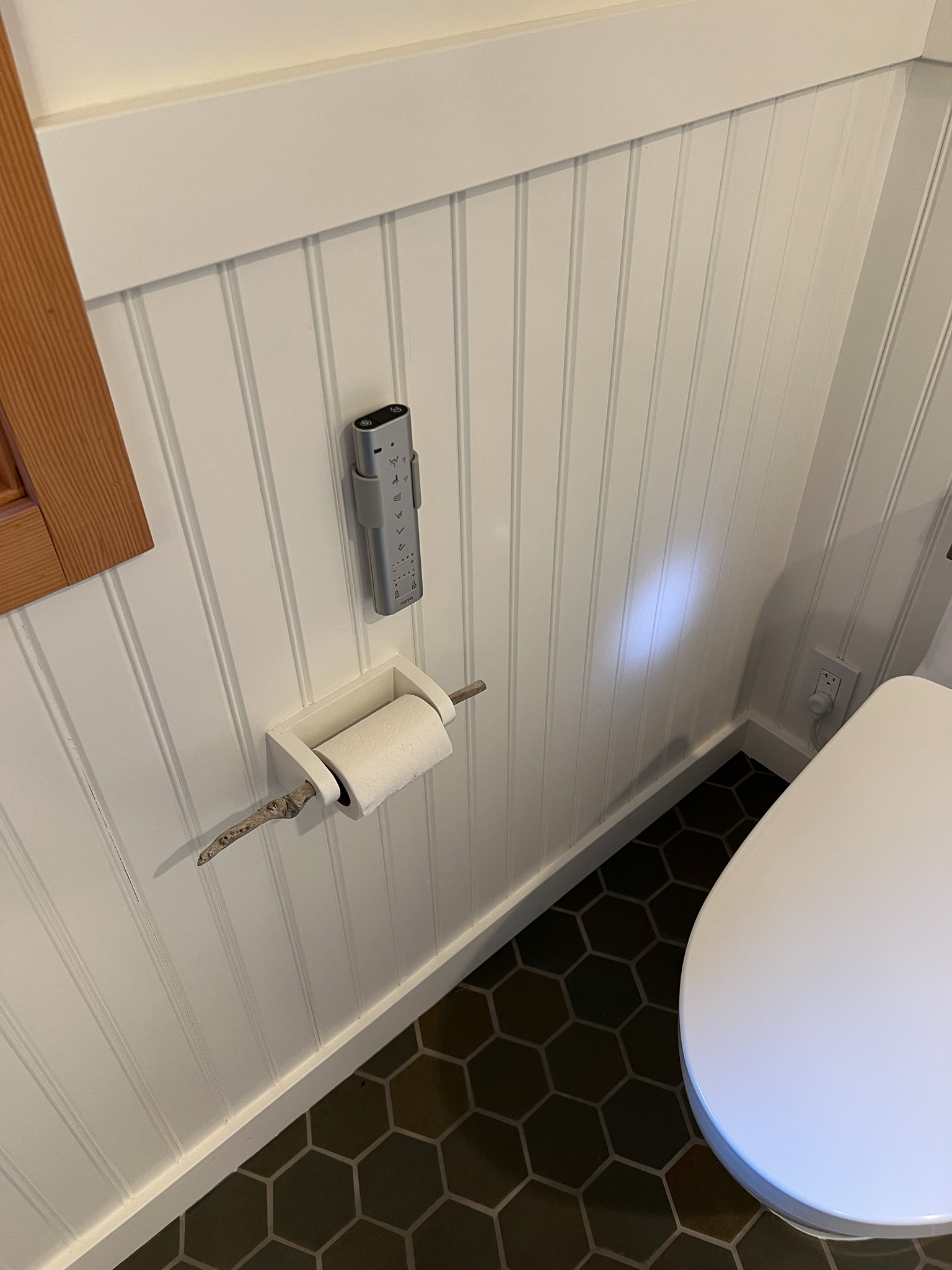
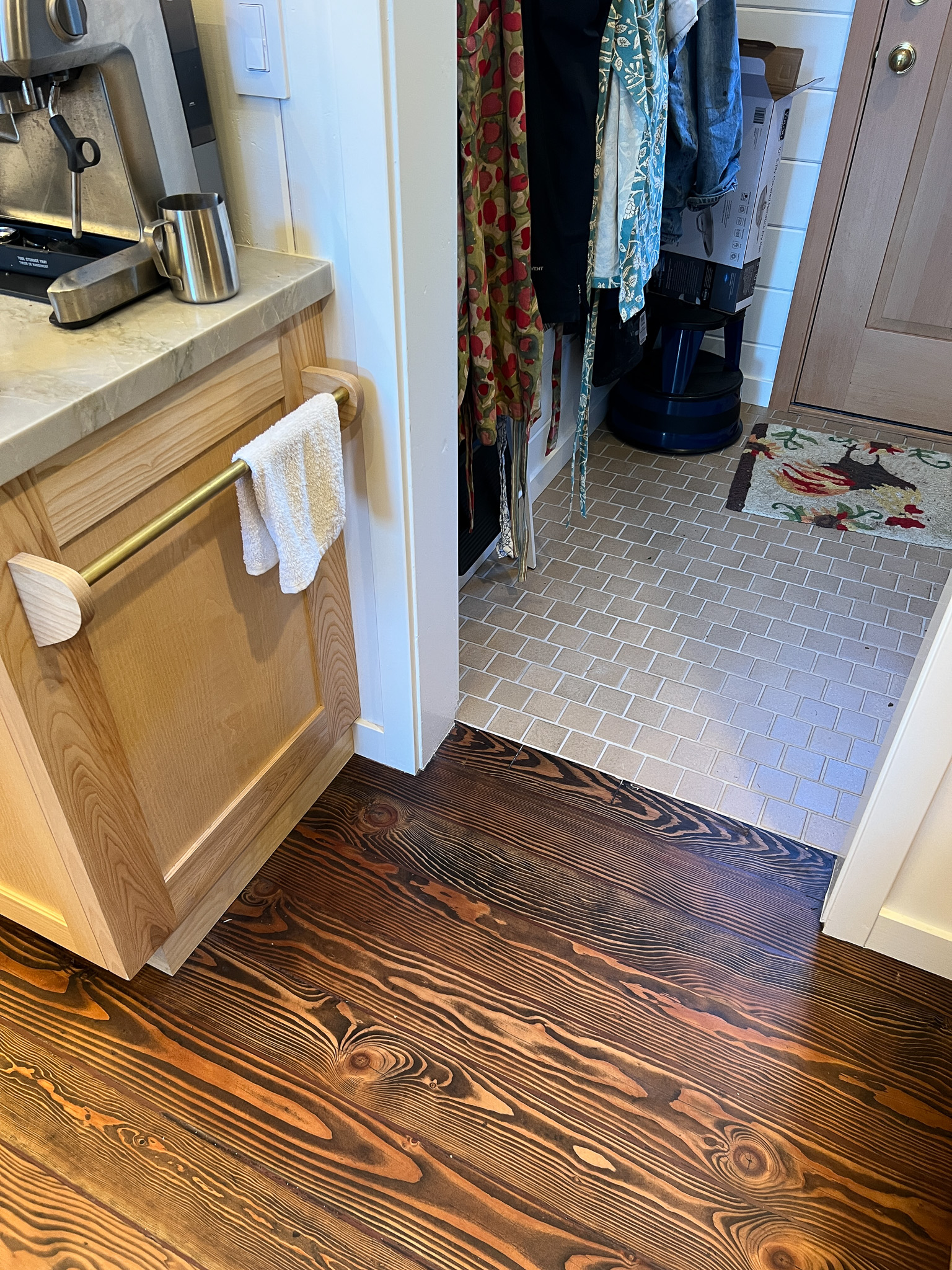
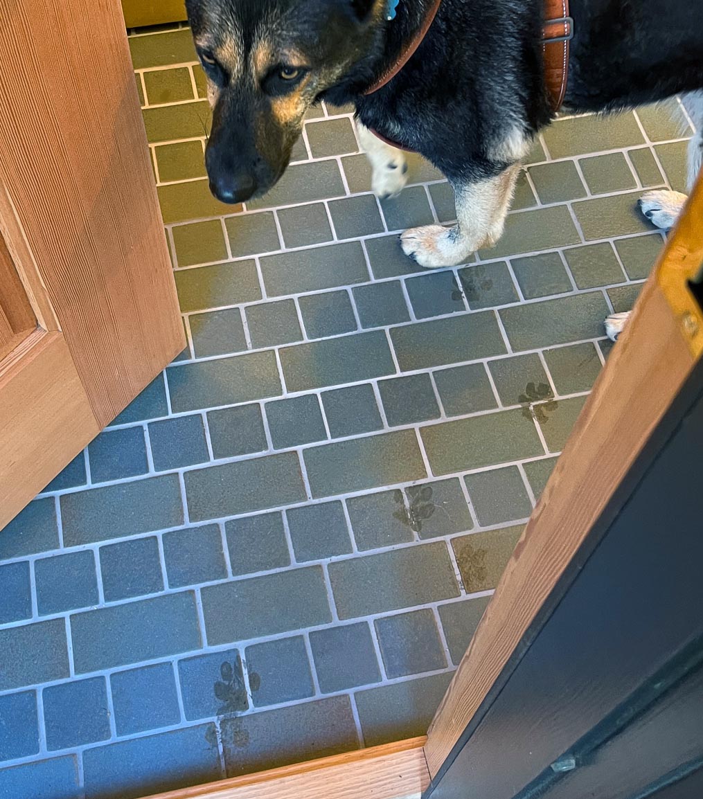
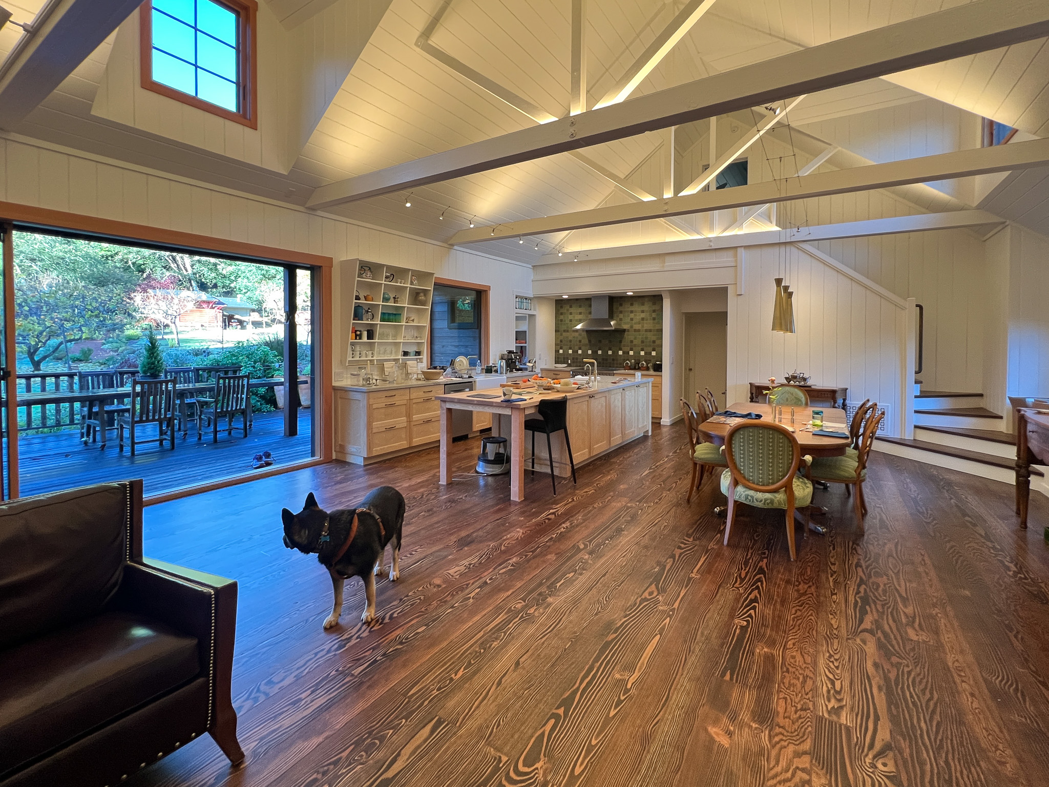
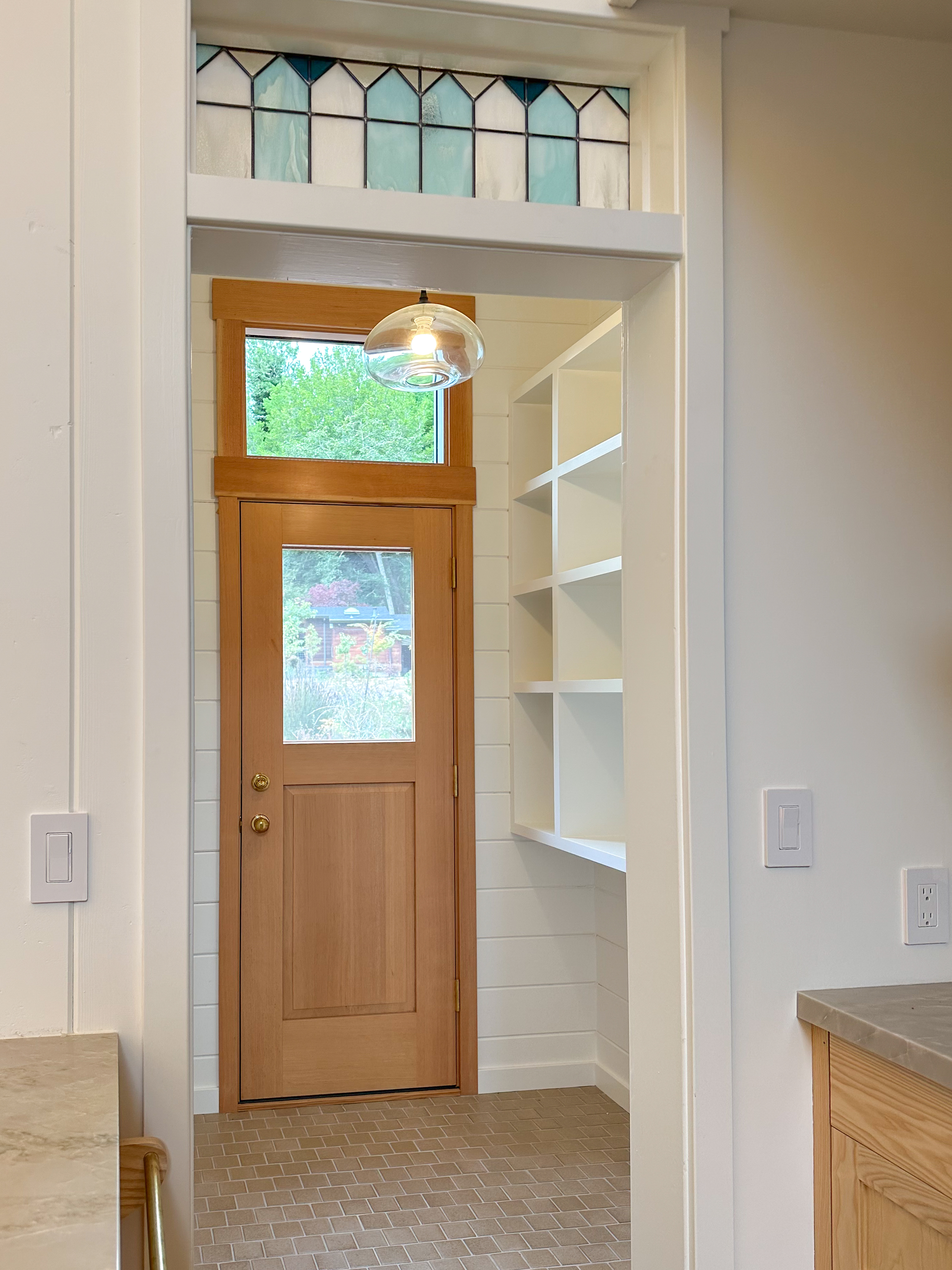
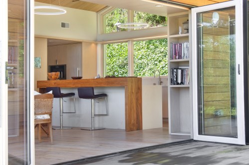
Looking down on the big room – I love the flooring – It is existing, structural tongue and groove fir subfloor, but it was lighter and kind of pickled with dark marine grade caulk/ filler between the boards. We thought of putting new flooring on top, but the boards were so nice and long, which is unusual these days. Once we put on the dark stain the super nice figured grain popped and we loved it. The indirect LED strip lighting atop the collar ties also worked out well. The electrician did a great job and knew to stop the lights a bit shy of the ends to minimize bright spots. (This photo accentuates the bright spots) Before shot of the flooring/ structural subfloor with younger Èowyn.I had a goal to be very particular about the clips for the shower glass. So often the clips are not given much thought and they ruin the simple clean look. (First I tried to talk the builder into no clips at the bottom, recessing the glass into the curb, but they were not game to try this detail. The green floor tile is Arto and the shower floor and walls is Fireclay.Èowyn likes the big window looking into the woodsI was proud of this built-in brass towel bar. (Kind of wish the electrical devices were more orderly/ aligned and in a real photo shoot Id probably not have a used towel. Oh well)High tech- low tech – this is the bidet/ heated toilet seat controller and also the handmade wood toilet paper holder with a found gnarled stick. Another custom brass towel bar – this one with ash. You can also see the cool grain in the floor and the mudroom floor tile by Arto. I thought I maybe specified too many pegs in the mudroom, but every single one was being used on the day I was there. Another picture of the green hex Arto tile transitioning to fir flooring. The decorative cold air return cover for the forced air system is in the base of the linen cabinet – painted white to match the cabinet. We had fun with the sun rays over the back door (replacing glass that just caused the mudroom to overheat) and John McBride carved us some more diamond posts for the new covered porch. (Porch is the only addition to the house) This is a photo of the architect’s dog tracking water into the clients recently finished house. Also a photo of very nice green (Elder Green by Arto..photo doesn’t do it justice) tile floor in the entry that can take a little water no problem.This is another view of the big room. Big bifold doors connect the space to the garden and orchard to the west. Ample lighting in the room is provided by indirect LEDs shining up and cable lights for task lighting over the kitchen and dining room. You can’t see all the added insulation in the roof and air sealing and new windows and doors to keep the space warm in the rainy season.Here you can see the ash diamond posts at the end of island that match the redwood ones outside and also the tiled backsplash..somewhat random but also a pattern.A view of the mudroom – pendant by Metrolighting and painted shelving, pretty mushroom Arto tile floor, splash of color in the stained glass (fabricated by Feral Studios, designed by yours truly) I’m not going to bother with the not so nice before shot, but I was very happy with the lighting in this room after construction – Three of these large pendants from Metro Lighting in Berkeley.
The clients sent me these photos from their recent visit to the project.
Im excited about the vaulted ceiling and the transition to the flat ceiling beyond. High south facing windows to the left are still covered in plywoodThis photo is looking back towards the entry (Defined by four 6×6 fir posts) and the kitchen (vaulted ceiling) Another shot of the kitchen (high windows covered)
We still are not ready for a full photo shoot, but we got a chance to visit this project in Inverness over the weekend. The remodel (Bay Builders general contractor) was extensive and included many upgrades to the exterior for energy efficiency, wild fire safety and general design improvement. We got to have some fun in the interior including the green Arto tile backsplash and the handmade ash island posts with diamonds cut into them. (They match the three redwood posts on the back porch)
Weve done a few of these in fir for interior and exterior, but this is the first one in ash. It will support a sitting area at the end of a kitchen island. Ill post photos after it is installed.
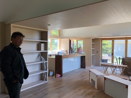
Still not quite finished, The owner is doing many things himself…slowly but surely. I didn’t want to wait to get a few pictures.
This was a typical Berkeley bungalow situation where the kitchen was separated from the yard by a laundry room and a kinda tight breakfast nook. Owner wanted to better connect to the garden and also upgrade things a bit. The upgrades included new custom wood windows & dutch door (Acosta Woodworking). (The existing windows were mostly aluminum sliders installed in the mid 1900s.)
Ash and painted cabinets were built by Xylo Interiors, Oakland. We collaborated on the design details.
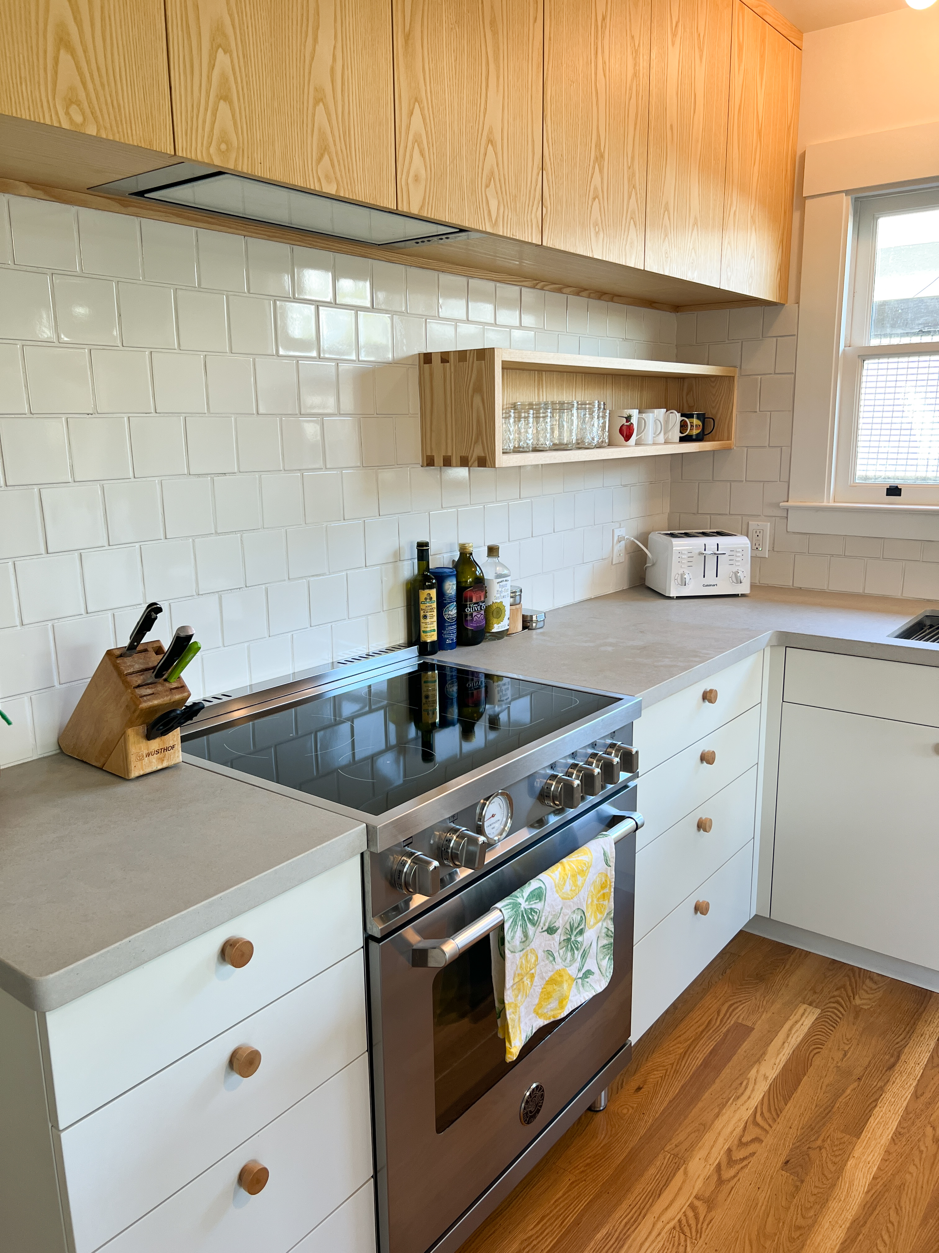
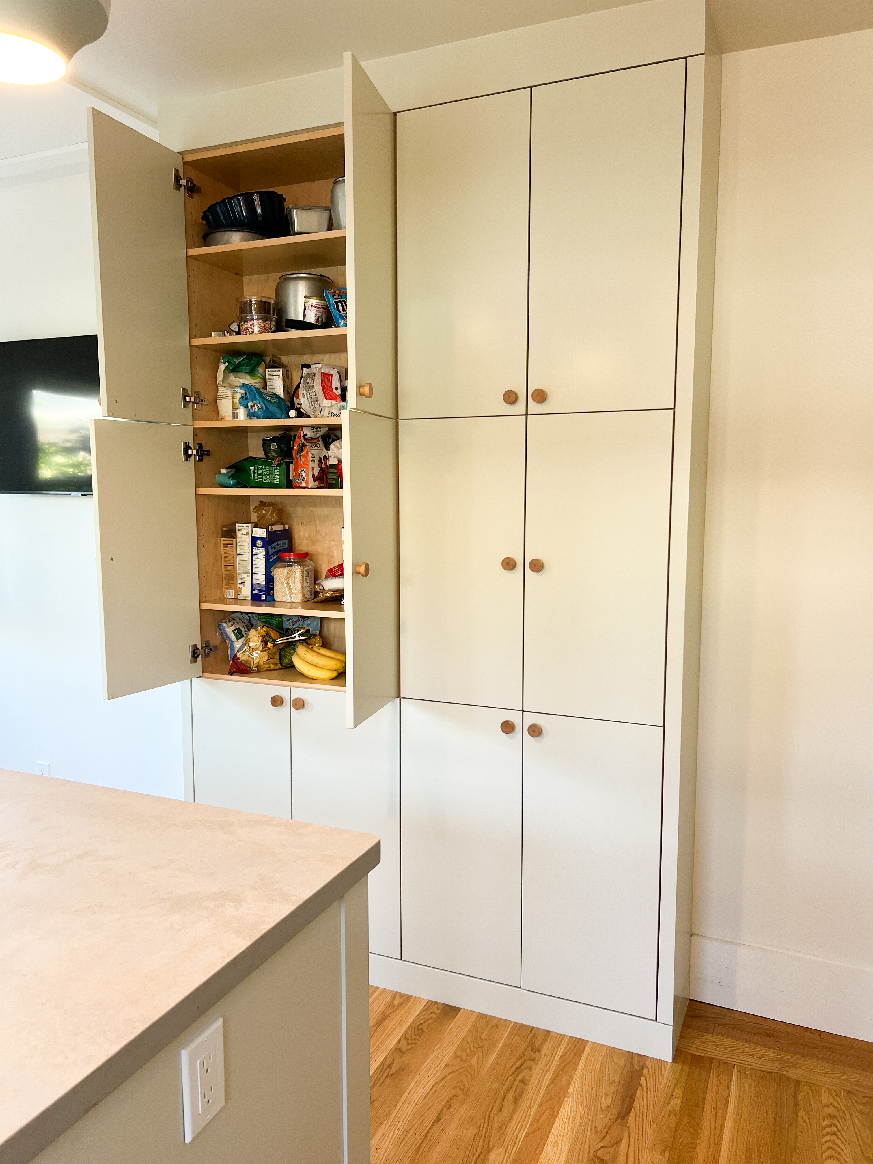
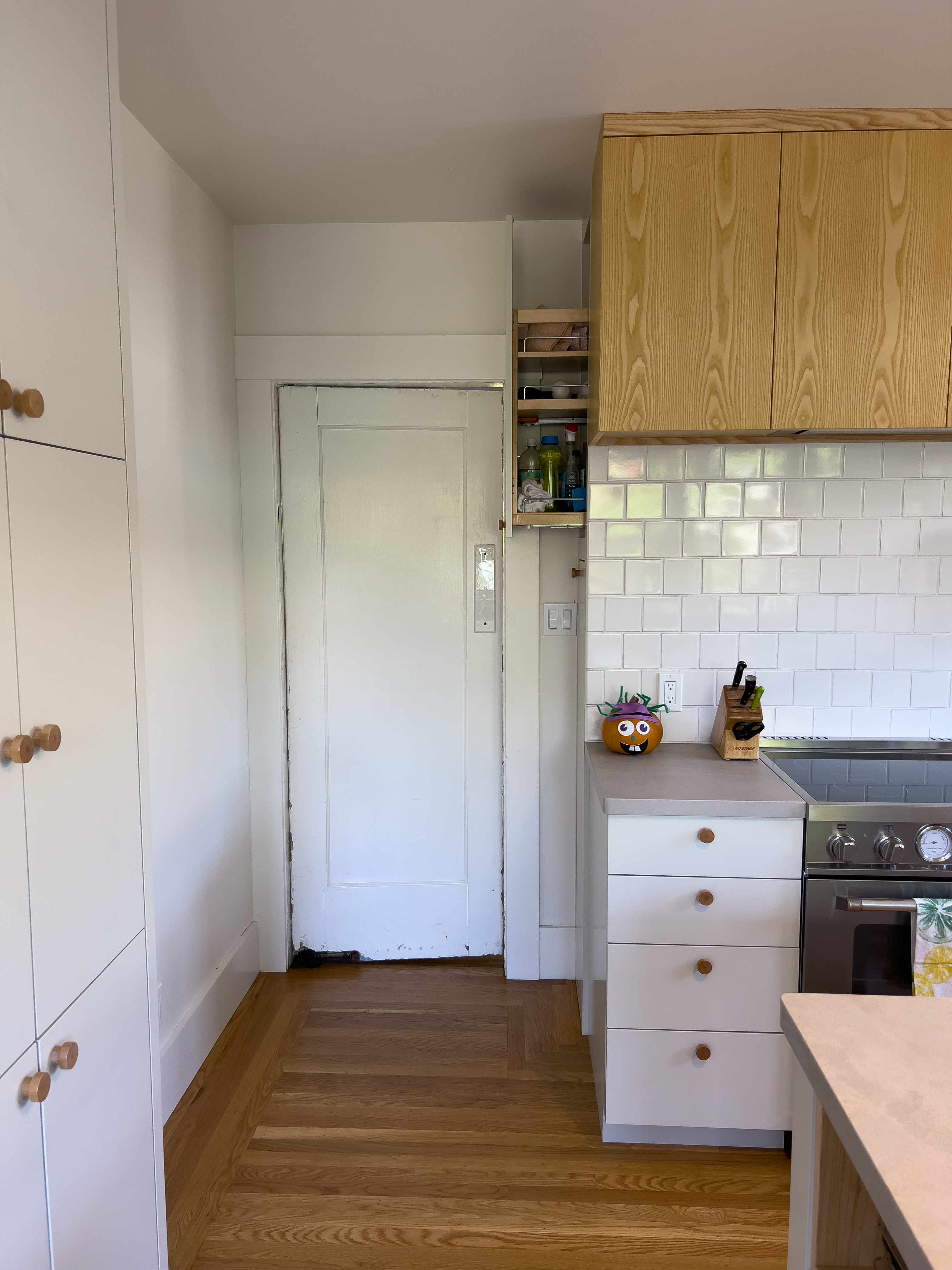
Lots of good storage details make for a well organized kitchen
Not 100% finished…but I visited last week and took some snapshots. This started as a kitchen remodel….but expanded into structural repairs of porch and roof, addition of a small porch on the back, and a tiny half bath in a strange little hallway. The owners chose many of the details themselves…lights, appliances, hardware etc, but McBride Construction and I pulled it all together.
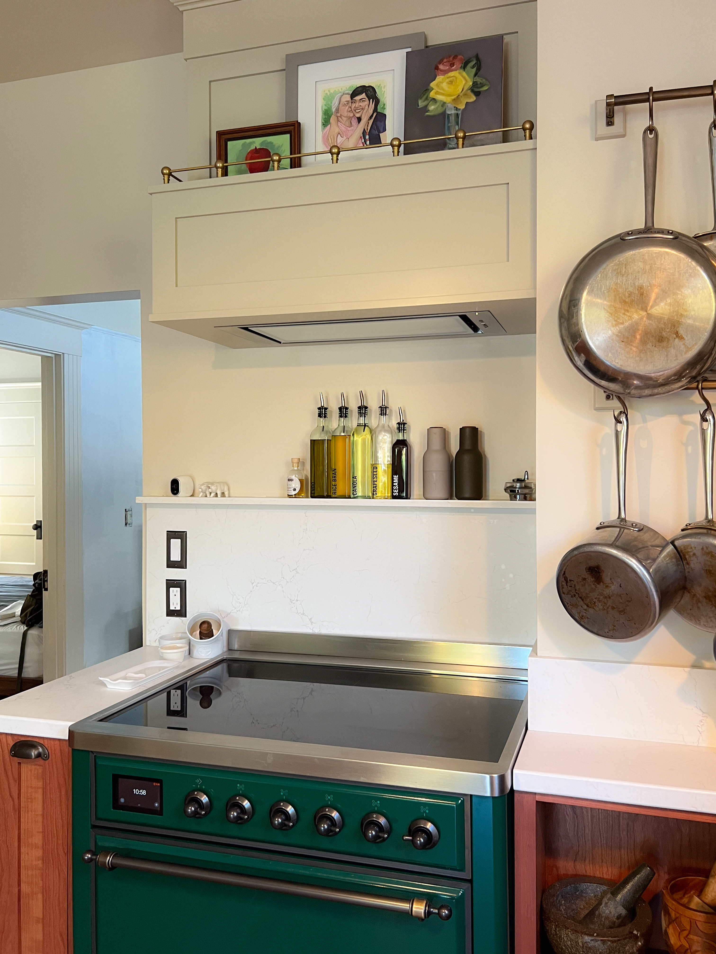
Felix in his new KitchenWe moved the door between kitchen and living room over a foot and made room for this wall of storage & small appliances to left of range (Where once there was a blank wall) Induction range with functional shelf and decorative shelf for art above the hoodThe very little half bathThe porch and railing was entirely rebuilt and we added some little LED lights in the postsNew back porchand the indoor/outdoor kitchen
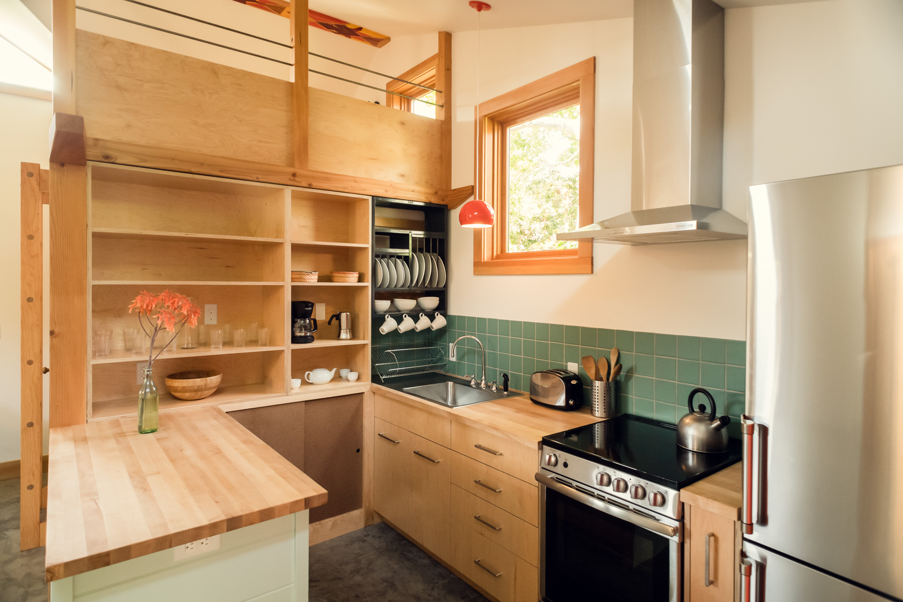
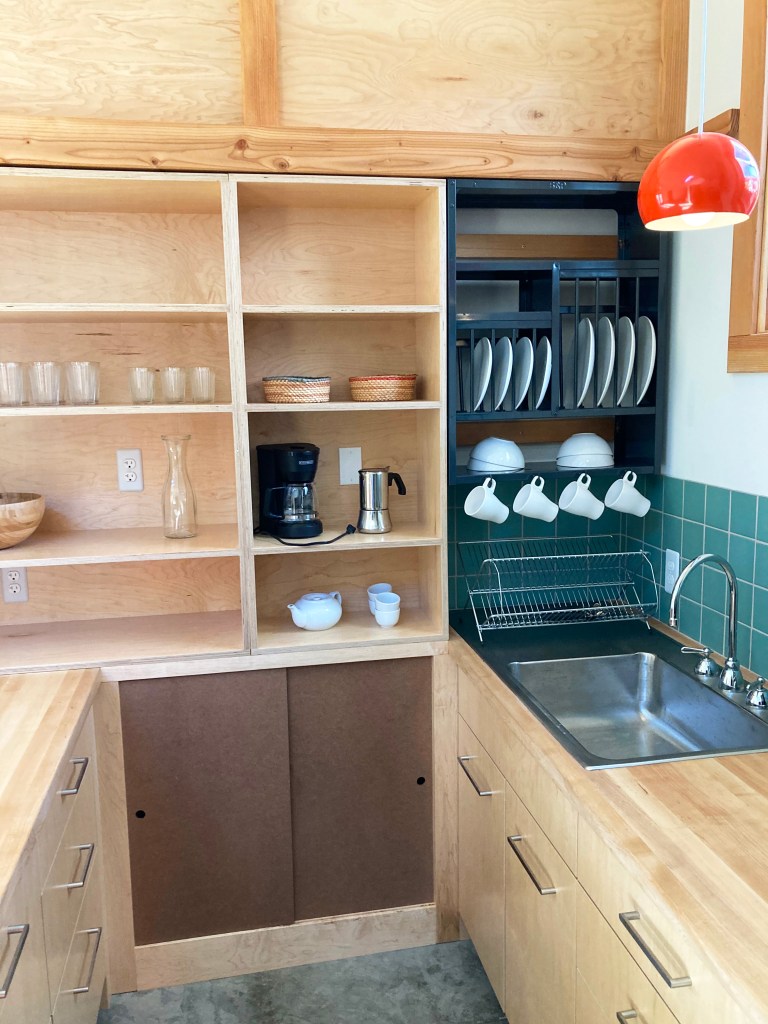
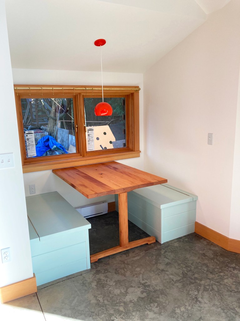
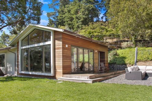
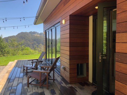
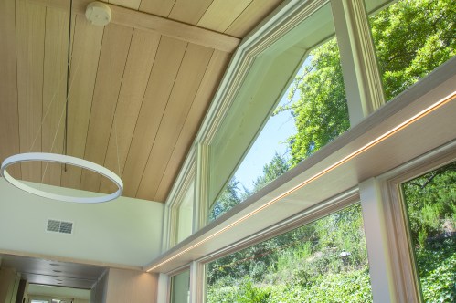
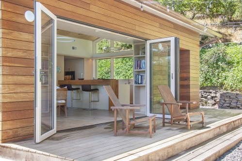
The builder (McBride Construction) is working his way through the punch list. We are both proud of how this rental cottage is turning out. Here are a couple of his snapshots:
The first one is the kitchen with built-in dish drying rack over the drainboard and apple-ply cabinets. The second is the little dining nook with storage benches and salvaged fir built-in table.
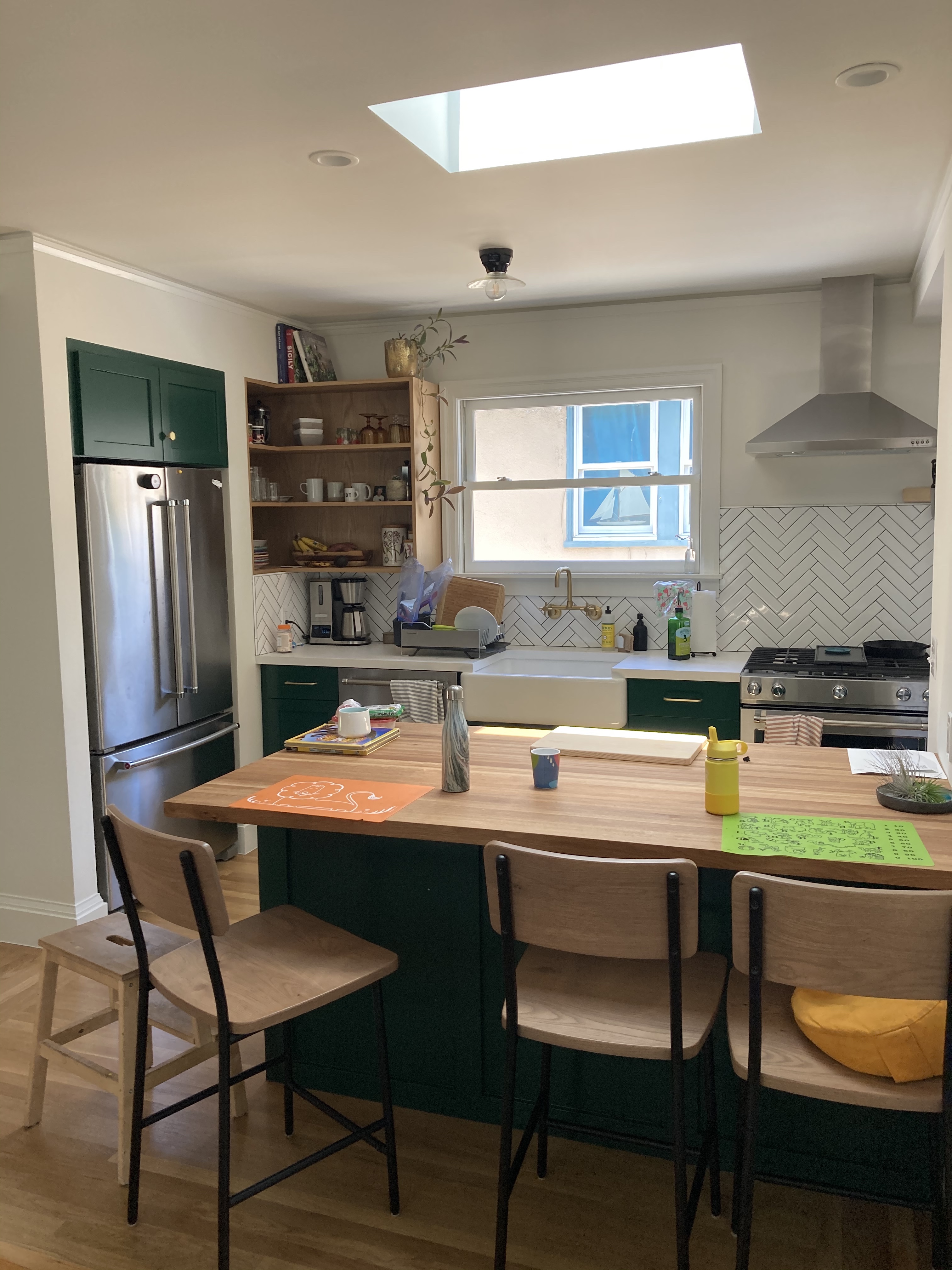
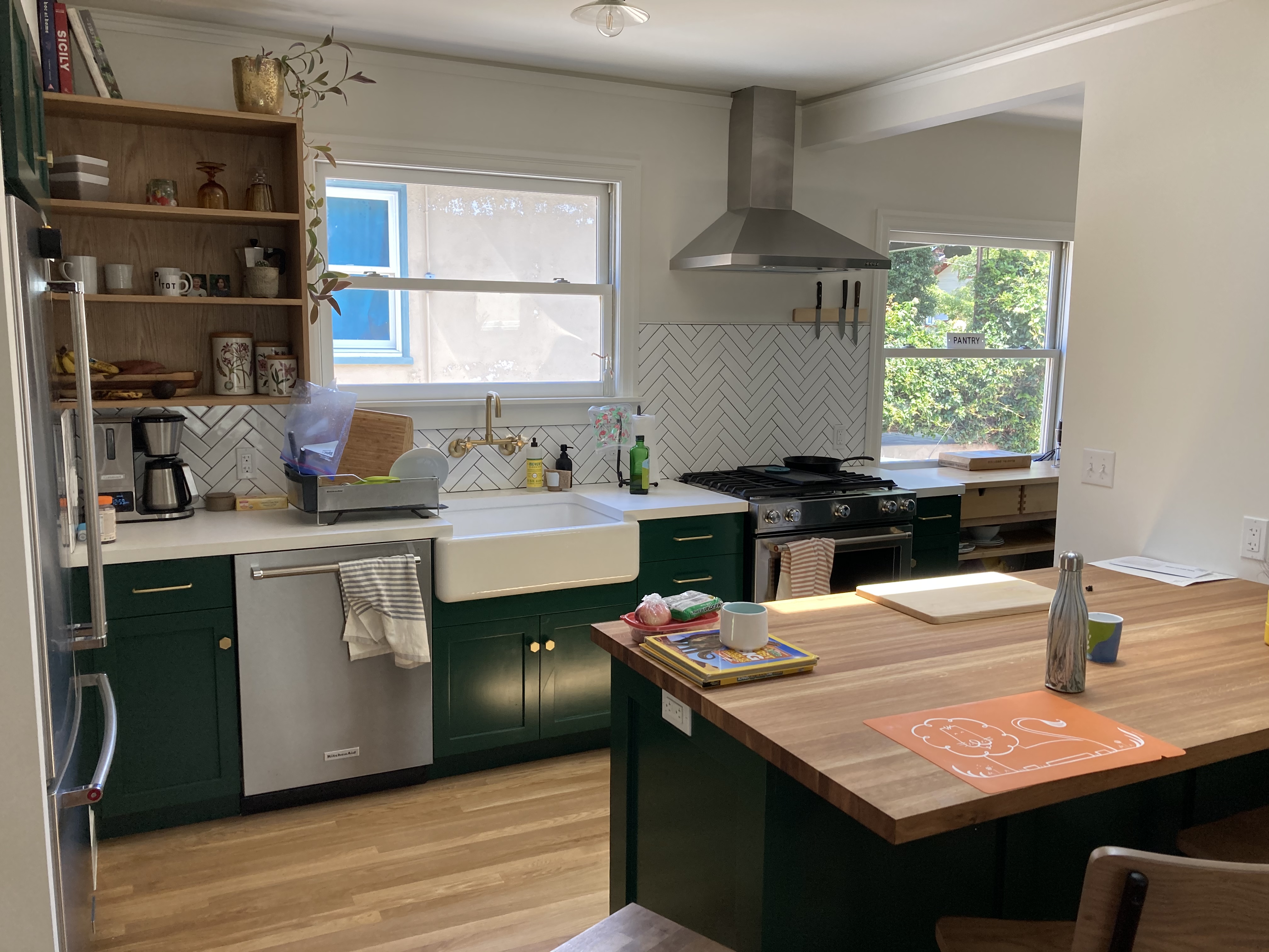
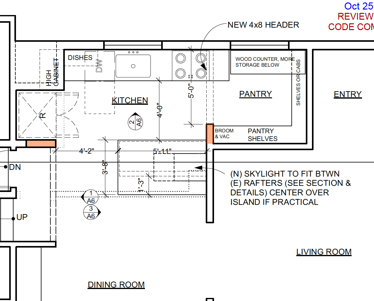
Since we are in a pandemic I wasn’t able to do a more formal photoshoot of these two projects. I also was not involved in every little decision, but they turned out well and the owners are happy to have nice new kitchens now as they shelter in place. Both projects involved removing a wall between kitchen and dining rooms, new cabinets, layout rearrangements, updated lighting, bar seating, a mix of wood and solid surface counters. One also got a skylight.
This first one was built by McBride Construction (Photos by John McBride)
Wood-topped peninsula between kitchen and dining room makes a great place to informally eat or do homework, but also serves as a buffet for the dining room