Feeds:
Posts
Comments

Posts Tagged ‘house surgery’

This kitchen was my first blog post, back in 2010.  I still employ many of these ideas. I revisited it because I was trying to talk a current 2020 client into laminate counters (with metal edge) instead of solid surface. It’s nice to remember this project.

I was hired to do a partial, tight-budget upgrade to this kitchen:

Alameda Kitchen before

This side of the kitchen we didnt change much.

This side of the kitchen we didnt change much. We did add a dishwasher…and the client took away one curtain ruffle.  The client wanted to keep the half of the kitchen with the sink, but tear out a wall and add some new cabinets and a laundry area on the other side.

We did add a dishwasher...and the client took away one curtain ruffle

Glowing Orb

The lighting in the kitchen consisted of one big light in the middle. This used to be standard, but most people these days have a lot of different lights in their kitchens.  I came to love this glowing orb.   It is sort of like a sun shining in the middle of the room.

this is the laundry center...with folding counter on top

this is the laundry center…with folding counter on top. Im not as in love with the metal edge on the splash as on the counter edge.

Another important feature came late in the design process.  As was normal for 1898, the kitchen was walled off and disconnected from the rest of the house.  The client didn’t think it was in their budget to make the changes necessary to rearrange the entire first floor, so we focused on making the kitchen nicer. Then we realized that it would be a pretty simple (low-cost)  and easily reversible change to cut a window in the wall separating dining  room and kitchen. This way food could be passed through and  communication could happen without killing the formality of the dining room.  Southern light from the kitchen window is an added feature in the dining room.looking through towards dinner

Happy client peeps through the new opening

Happy client peeps through the new opening

Other features of affordability and style are the colorful plastic laminate counter tops with 50s style metal edge banding,  the beautiful green Marmoleum floor (you’ll have to just believe me because you can’t really see it  in the photos, & the open space for art that is available because the client didn’t squeeze in as many upper cabinets as they possibly could.

Of course keeping half of the old kitchen was a big cost savings. The new part looks different, but complimentary.  Palimpsest architecture is the word for this sort of layering and leaving ghosts of the past rather than tearing out everything and starting over. .  http://en.wikipedia.org/wiki/Palimpsest

Contractor: Guillaume Canivet

Cabinetmaker: Rusty Dobbs

Read Full Post »

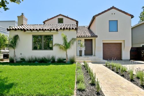
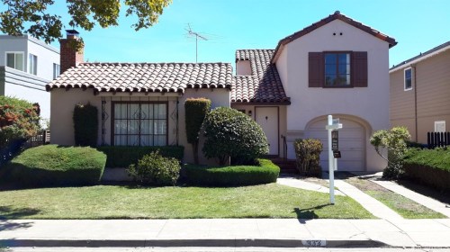
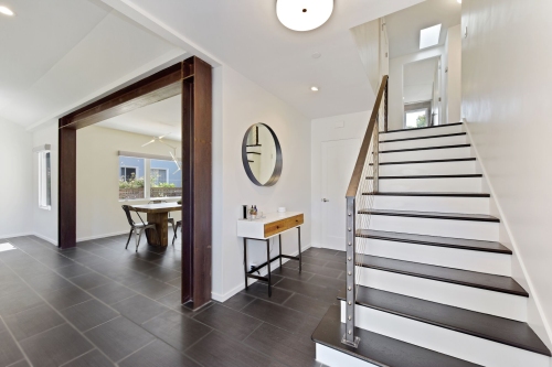
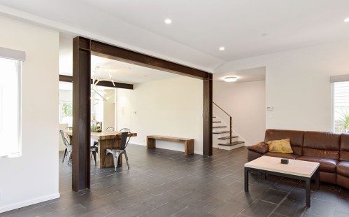
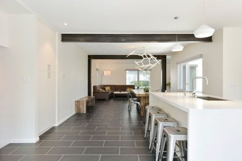
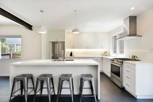
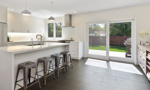
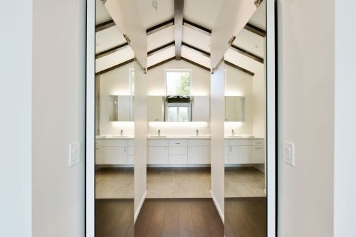
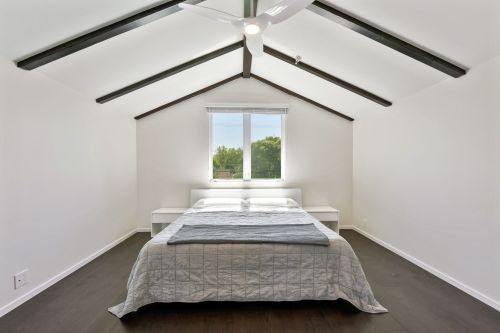
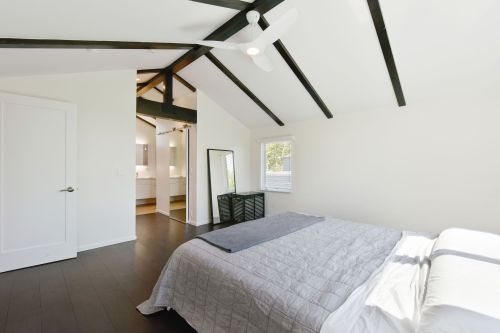
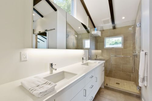
This was a dated Spanish Eclectic house with minimal connection to the yard and lots of little rooms. We tore out most of the walls on the main floor. This required adding a steel moment frame that we left exposed, finished with gun-blue and wax. Living room, dining room, and kitchen flow together and all enjoy a view out big doors to the deck and yard.  The owners exercised a lot of restraint in their selection of interior finishes and materials.  Upstairs we added an open plan, light-filled master suite with vaulted ceiling and updated the other bathroom and bedrooms. A radiant heating system in the floor was added throughout.    Now it’s time to fill the white walls with art and break it in!

Built by Accolade Construction, Engineering: AJ Miller & Associates,

Photos by Open Homes Photography

Avila Front

437673_2

Before Shot

Avila Foyer Big

Entry Hall

Avila Steel.1

Living/ Dining

Avila Great Room Big

View through main floor

Avila Kitchen Big

Kitchen

Avila Kitchen3

Kitchen

Avila Master Suite

MAster Bath

Avila MAster Bedroom

MAster Bedroom

Avila Master Suite 2

Master Suite

Avila Master Bath

Master Bath

Read Full Post »

Many houses have floor plans that don’t work very well. In the case of this project, the first problem is a nice living room disconnected from the rest of the house.  (You have to go through the vestibule to get to the living room and the vestibule is not very big, especially if you include a coat tree and shoe storage.  When I arrived and saw the space it also became clear that the kitchen/ diningroom connection could also be improved, as well as kitchen storage and counter space.

The budget isn’t grand, but a lot can be gained with a few small changes.

asbuilt

We will close the opening between vestibule and dining room and open a bigger one directly from dining room to living room. Then we will eliminate a big chunk of hallway between kitchen and dining and use this space to expand the kitchen counter and add some dearly needed kitchen storage.

proposed plan

Someday things might shift back the other way, but for now, most people seem to prefer informal dining that is very connected to the kitchen.

Read Full Post »

This is my first post.  I wanted to share a few kitchen design ideas and, in particular, a partial, tight-budget kitchen remodel that I assisted with in Alameda, California.  The client, it turns out, has a great design sense herself, but she needed a bit of help.

I was hired to do a partial, tight-budget upgrade to this kitchen:

Alameda Kitchen before

This side of the kitchen we didnt change much.

This side of the kitchen we didnt change much.

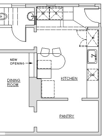
I started by measuring and discussing her needs and visions for the space.  She wanted to keep the half of the kitchen with the sink, but tear out a wall and add some new cabinets and a laundry area on the other side.

kitchen plan

We did add a dishwasher...and the client took away one curtain ruffle

We did add a dishwasher…and the client took away one curtain ruffle

Can you see the metal edge banding on the counter top?

Can you see the metal edge banding on the counter top?

The lighting in the kitchen consisted of one big light in the middle. This used to be standard, but most people these days have a lot of different lights in their kitchens.  I came to love this glowing orb.  It is sort of like a sun shining in the middle of the room.

The Glowing Orb!

The Glowing Orb!

klitchen island and hole in action

looking through towards dinner

this is the laundry center...with folding counter on top

this is the laundry center…with folding counter on top

Another important feature came late in the design process.  As was normal for 1898, the kitchen was walled off and disconnected from the rest of the house.  The client didn’t think it was in their budget to make the changes necessary to rearrange the entire first floor, so we focused on making the kitchen nicer. Then we realized that it would be a pretty simple (low-cost)  and easily reversible change to cut a window in the wall separating dining  room and kitchen. This way food could be passed through and  communication could happen without killing the formality of the dining room.  Southern light from the kitchen window is an added feature in the dining room.

Happy client peeps through the new opening

Happy client peeps through the new opening

Other features of affordability and style are the colorful plastic laminate counter tops with 50s style metal edge banding,  the beautiful green Marmoleum floor (you’ll have to just believe me because you can’t really see it  in the photos, & the open space for art that is available because the client didn’t squeeze in as many upper cabinets as they possibly could.

Of course keeping half of the old kitchen was a big cost savings. The new part looks different, but complimentary.  Palimpsest architecture is the word for this sort of layering and leaving ghosts of the past rather than tearing out everything and starting over. .  http://en.wikipedia.org/wiki/Palimpsest

Contractor: Guillaume Canivet

Cabinetmaker: Rusty Dobbs

Read Full Post »