I kept this elegant tub surround alive for a few extra years by patching it with fiberglass and epoxy, but I think it was time for an upgrade.

partially demolished, you can see both layers of old surround – fiberglass on top of coated masonite – with a european street scene in sepia….perhaps from the early 60s?

pacific tile putting on a layer of thinset mortar over the wonderboard (over building paper & moiststop at the tub lip)

the first row of tiles – cut to fit the curved tub
I don’t have any photos of the plumber at work, but he installed copper rough plumbing for this shiny new shower faucet. It has a modern take on the cross handle for the valve, and a nice curvy tub spout.
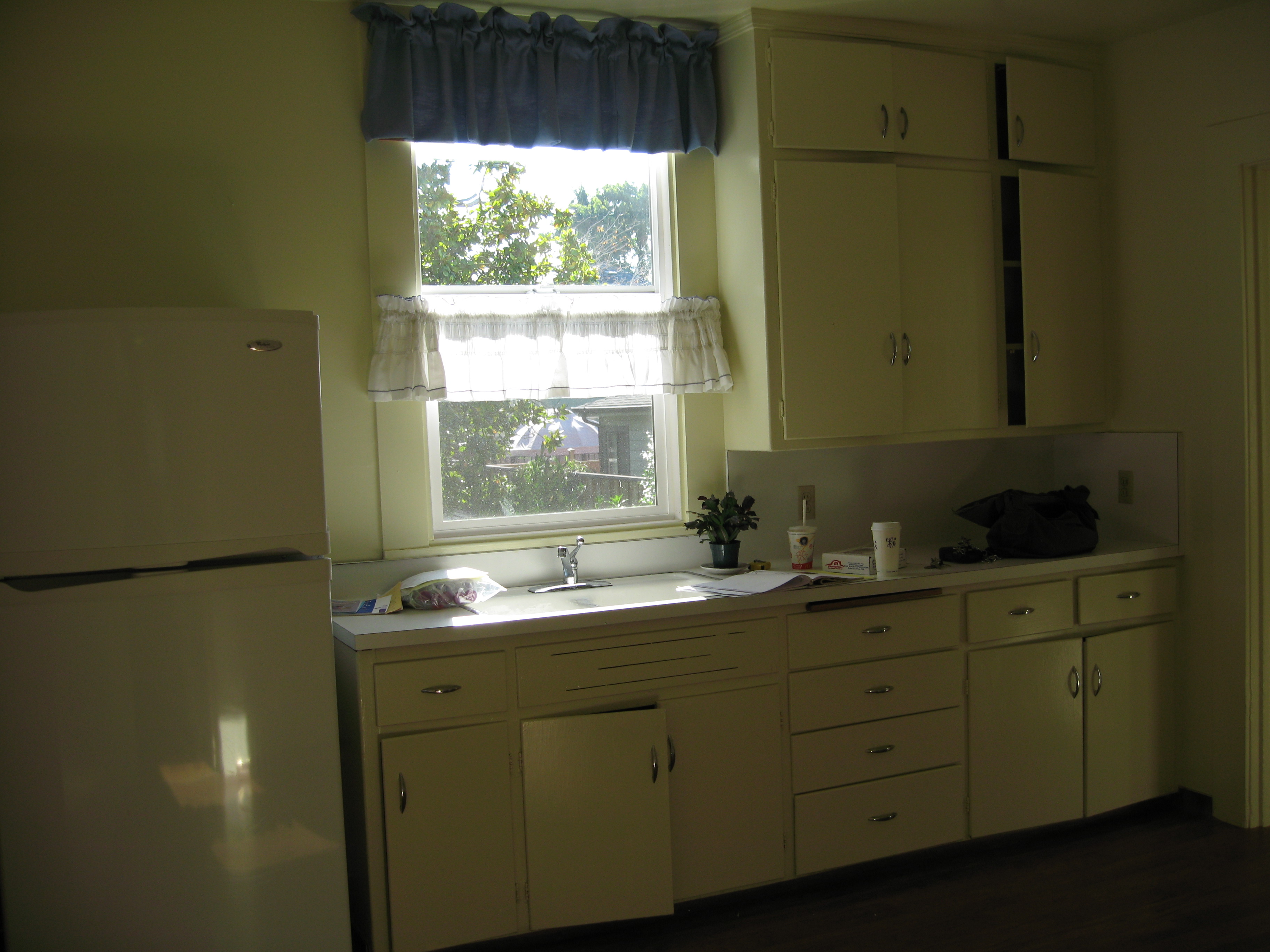
I would not recommend buying the cheapest shower curtain rod or brackets. I did, and I notice spots of rust already forming on the chrome.
The tiles are 4×4 white (0100) Daltile Rittenhouse Square with a god’s eye pattern in yellows and blues. Keeping the pattern in the middle meant that all my trim tiles and fussy cut tiles would be white. Extra ones when we ran out were easy to come by. It also made finding a recessed soap dish easy and repairs down the road possible. Affordability is another advantage.
We used bright white unsanded grout and white adhesive caulking to complete the clean white look.

Daltile white 0100 4×4 squares with a god’s eye pattern in blue and yellow
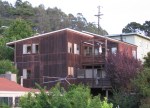
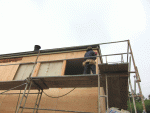
I don’t think I got a screaming deal, in part because I was in a rush, trying to reduce the inconvenience for my renters. The plumber was about $575, the tile setter $1300, the tiles, grout, caulk, and sealer, about $250 and the plumbing hardware another $375 or so. Call it about $2500 + a few more hours of carpentry work, sheetrock repair, clean up, and a dump run bring it to about $3200. I still have to repaint the ceiling on the lower level where we had to open it up for plumbing access.