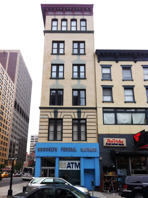
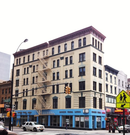
This building caught my eye because of the bold color choice that seemed unusual for a money-lending institution. The simple bright blue base complements the brick patterns above that are reminiscent of Native American designs. This shade of blue reminds me a bit of Mexico. I find the overall effect to be bold and quite pleasing…but I imagine that many might consider the blue too bright for such an application.
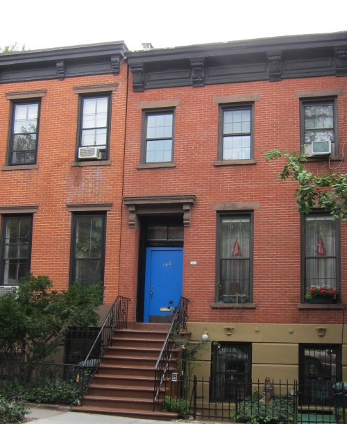
Below are some other shades of blue in the same neighborhood. This blue door is rather jarring with the red brick and dark trim. I’m not sure the “mexican blue” above would be any better for this house.
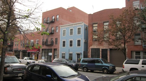
This blue is softer and has a bit of grey-brown mixed in. It reminds me of colonial American houses and New England.
and another blue door that is a bit more subdued and softened with white and grey.
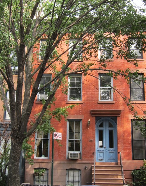 Personally, I am actually not a fan of blue paint with red brick in any shade, bright or soft.

Leave a comment