This is my first post. I wanted to share a few kitchen design ideas and, in particular, a partial, tight-budget kitchen remodel that I assisted with in Alameda, California. The client, it turns out, has a great design sense herself, but she needed a bit of help.
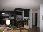
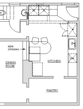
I was hired to do a partial, tight-budget upgrade to this kitchen:


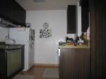
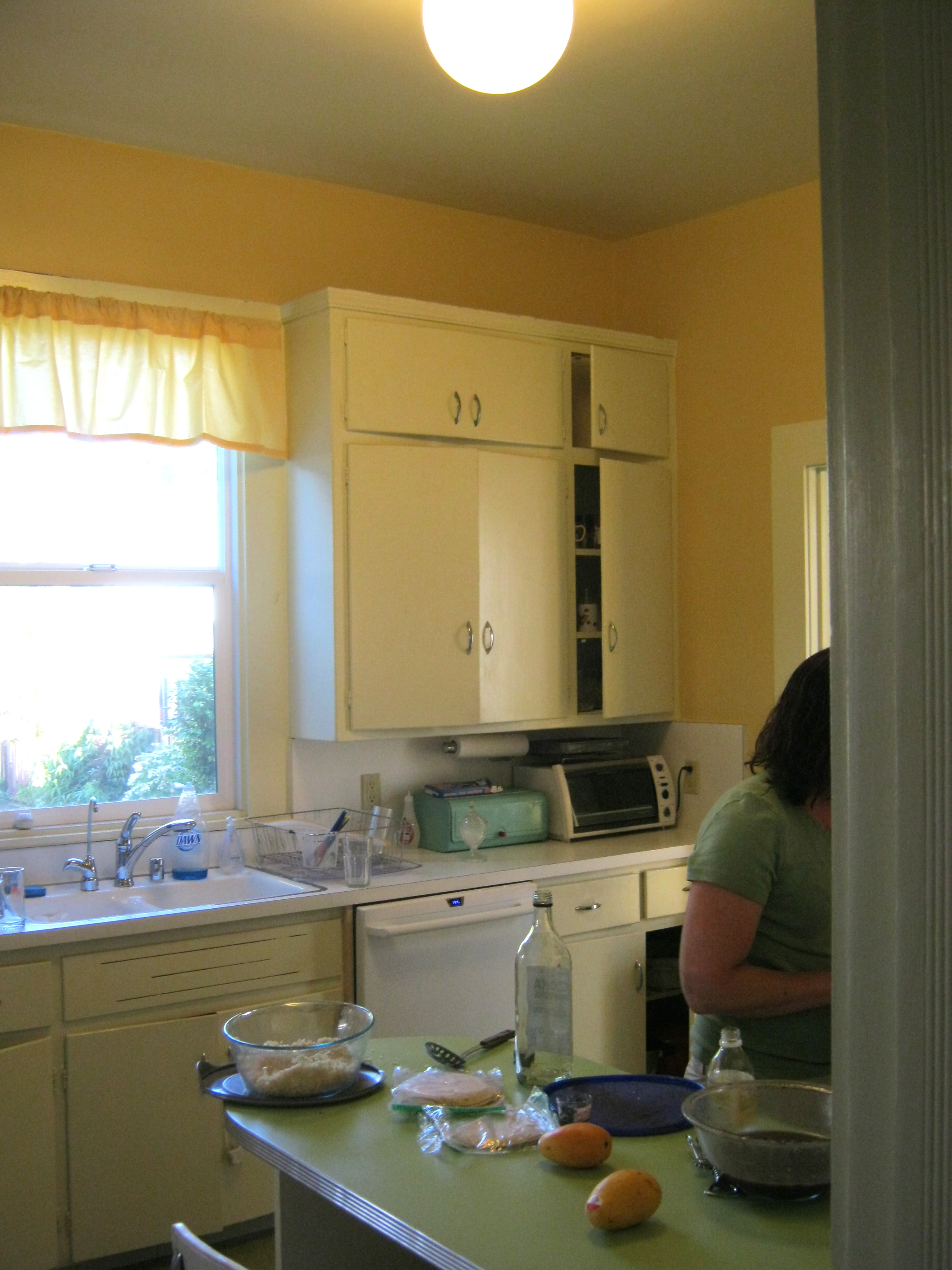
This side of the kitchen we didnt change much.
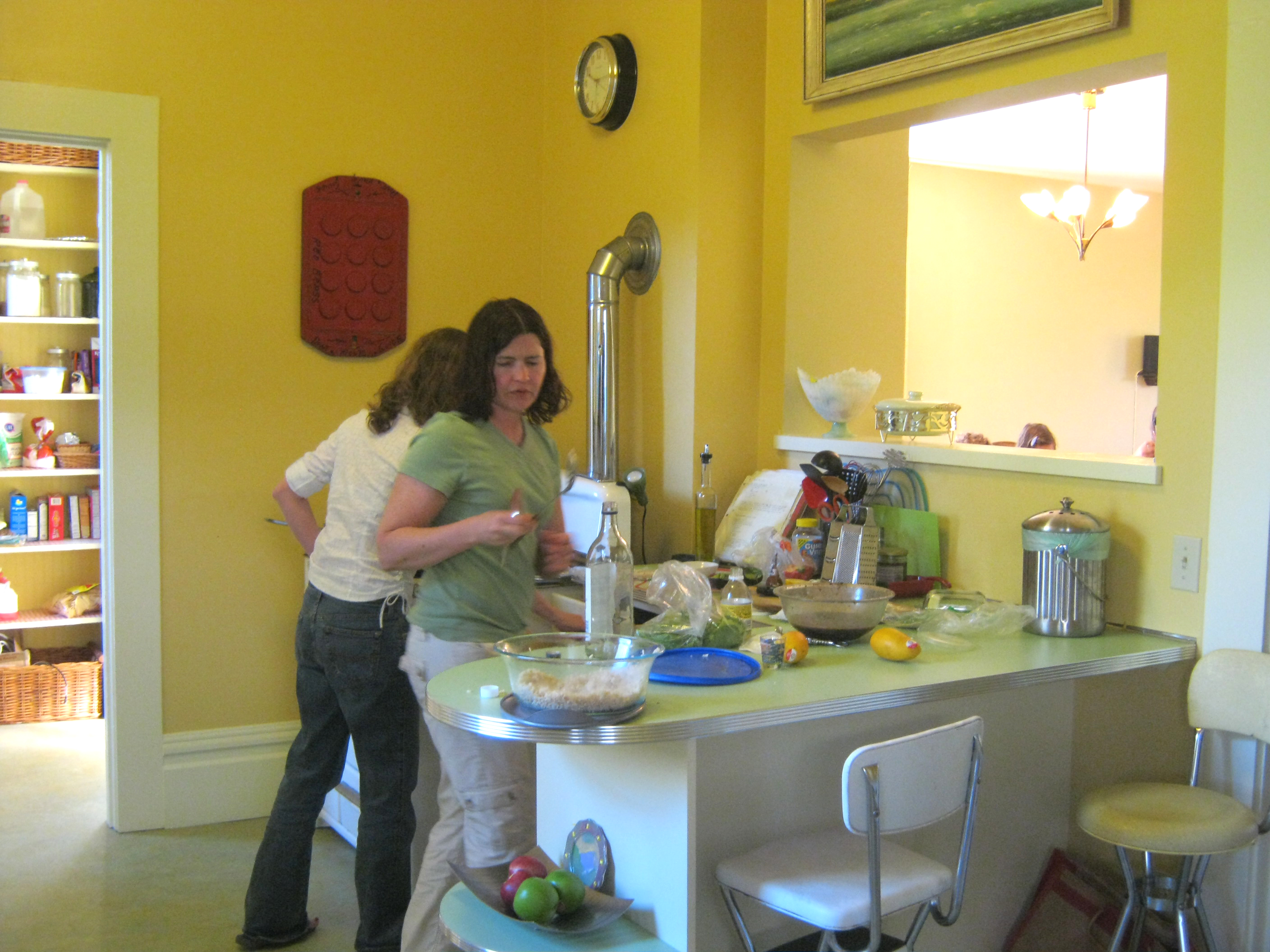
I started by measuring and discussing her needs and visions for the space. She wanted to keep the half of the kitchen with the sink, but tear out a wall and add some new cabinets and a laundry area on the other side.


We did add a dishwasher…and the client took away one curtain ruffle

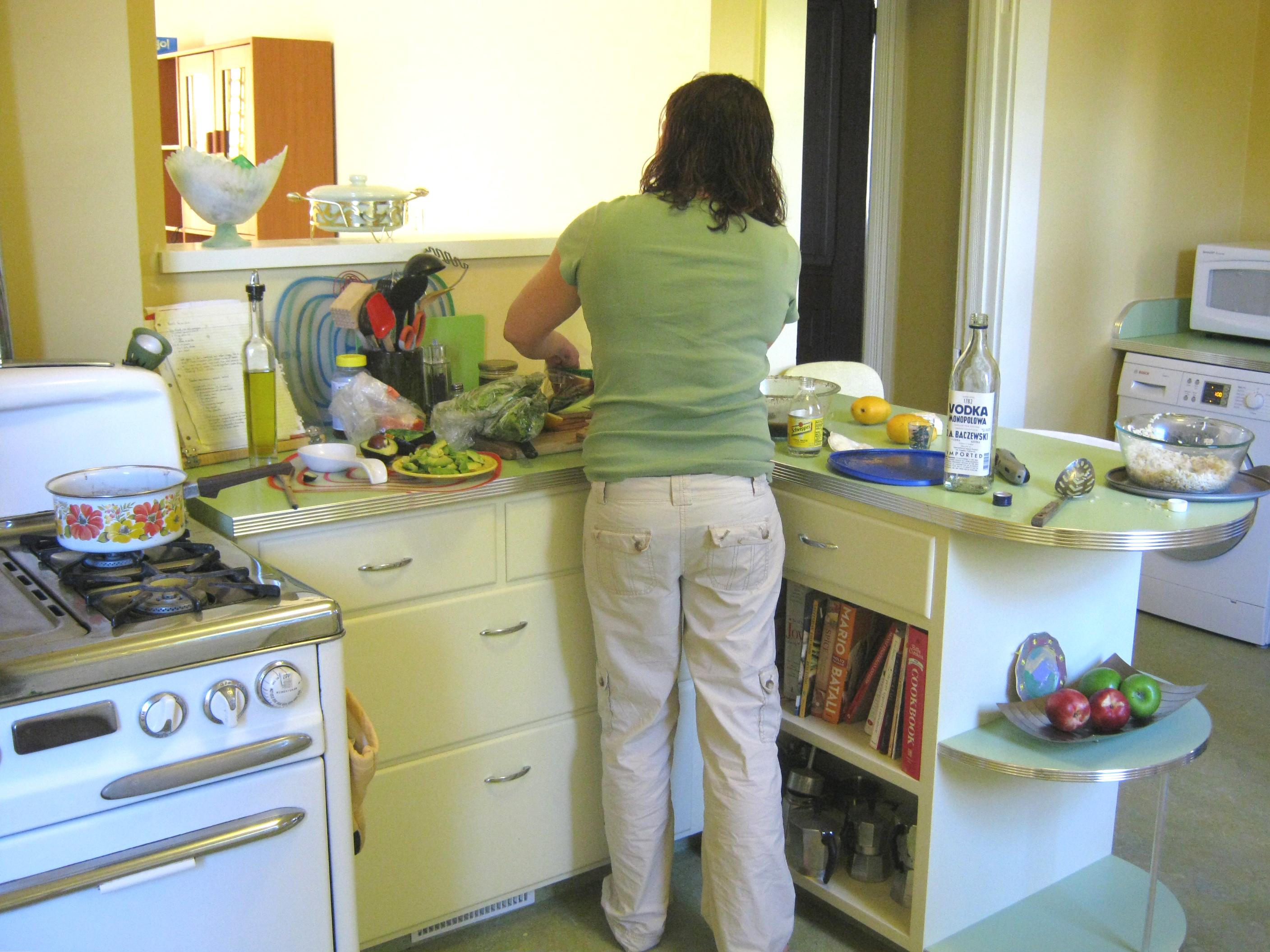
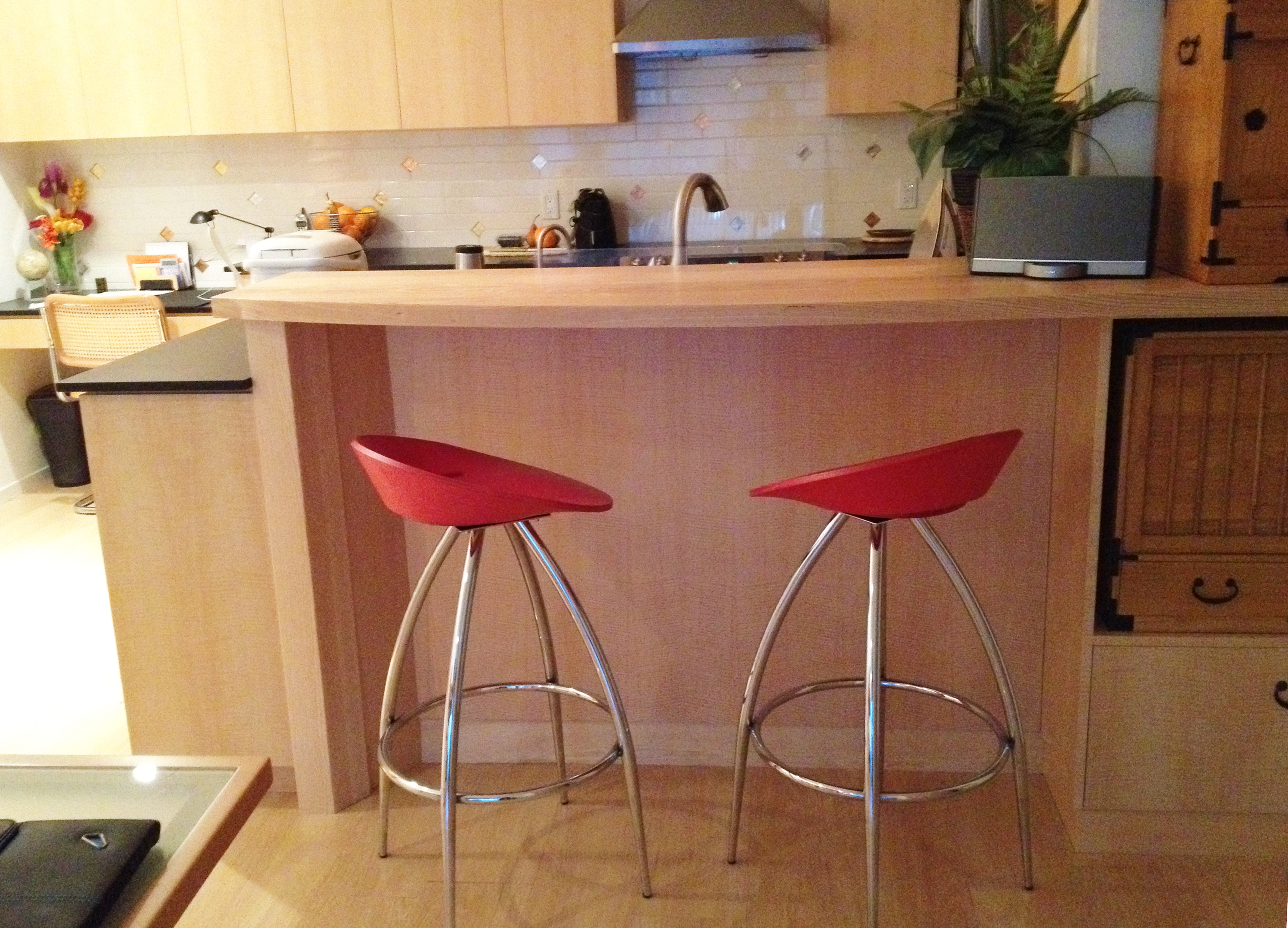
Can you see the metal edge banding on the counter top?
The lighting in the kitchen consisted of one big light in the middle. This used to be standard, but most people these days have a lot of different lights in their kitchens. I came to love this glowing orb. It is sort of like a sun shining in the middle of the room.

The Glowing Orb!


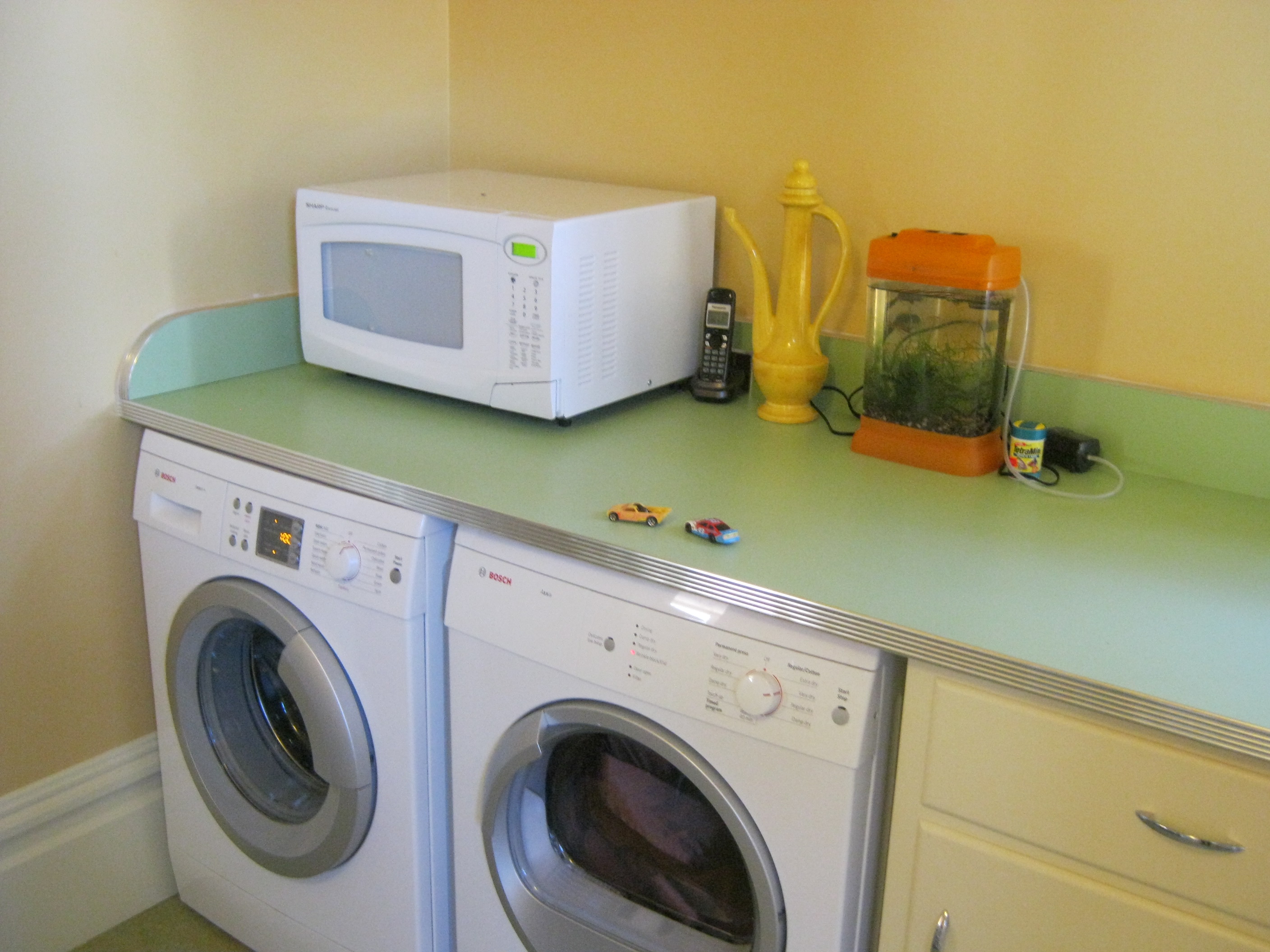
this is the laundry center…with folding counter on top
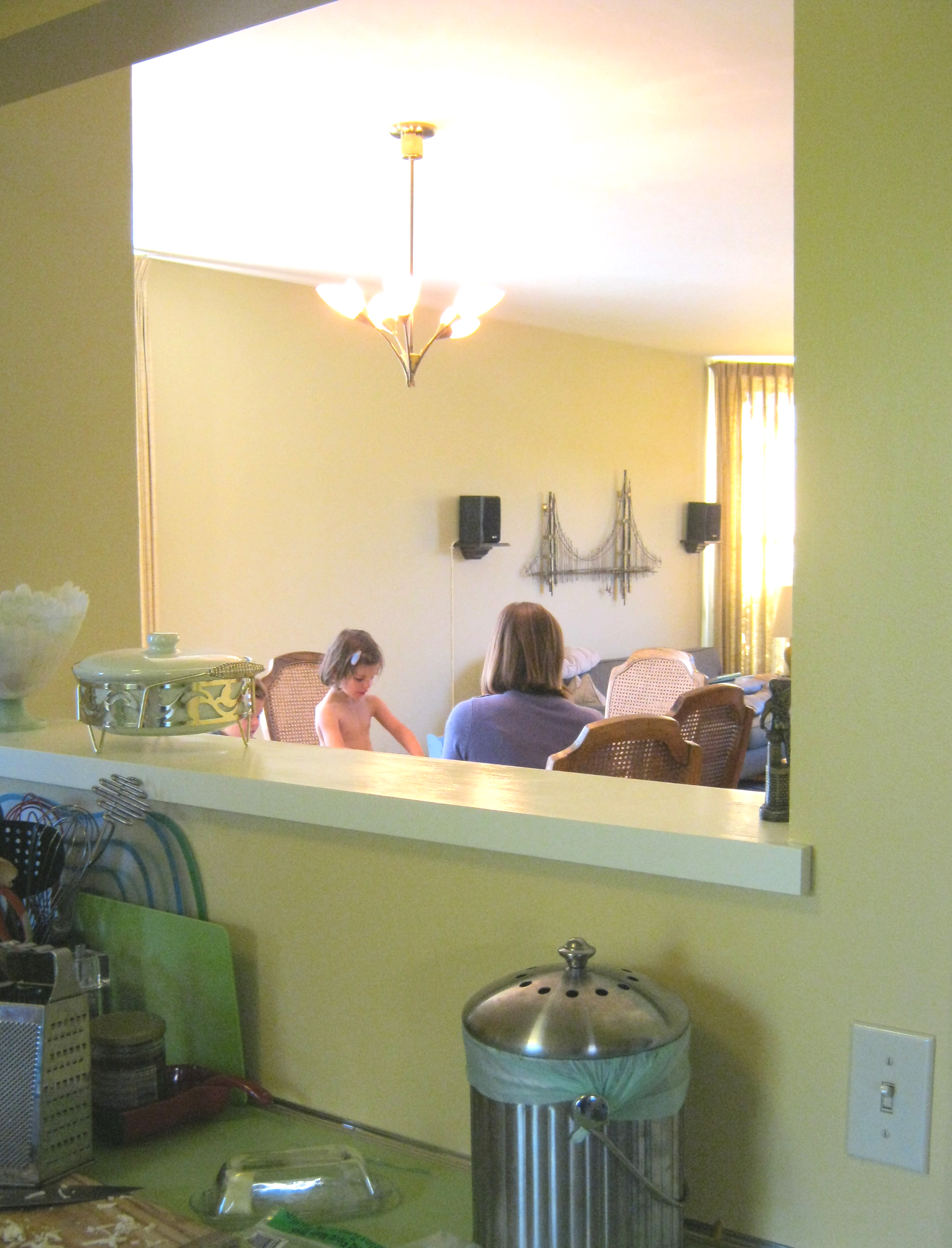
Another important feature came late in the design process. As was normal for 1898, the kitchen was walled off and disconnected from the rest of the house. The client didn’t think it was in their budget to make the changes necessary to rearrange the entire first floor, so we focused on making the kitchen nicer. Then we realized that it would be a pretty simple (low-cost) and easily reversible change to cut a window in the wall separating dining room and kitchen. This way food could be passed through and communication could happen without killing the formality of the dining room. Southern light from the kitchen window is an added feature in the dining room.

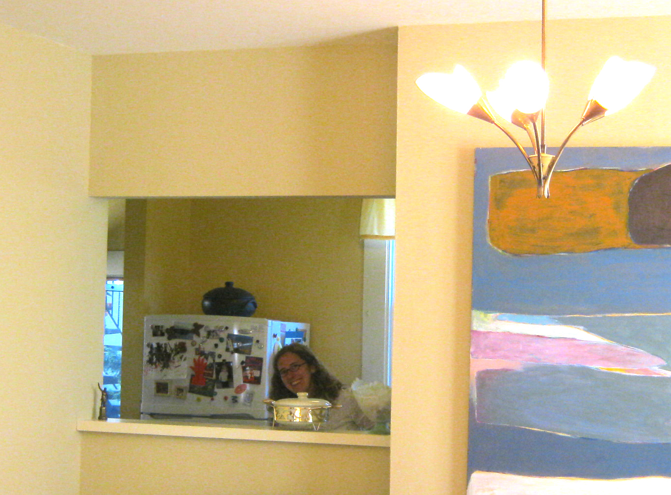
Happy client peeps through the new opening
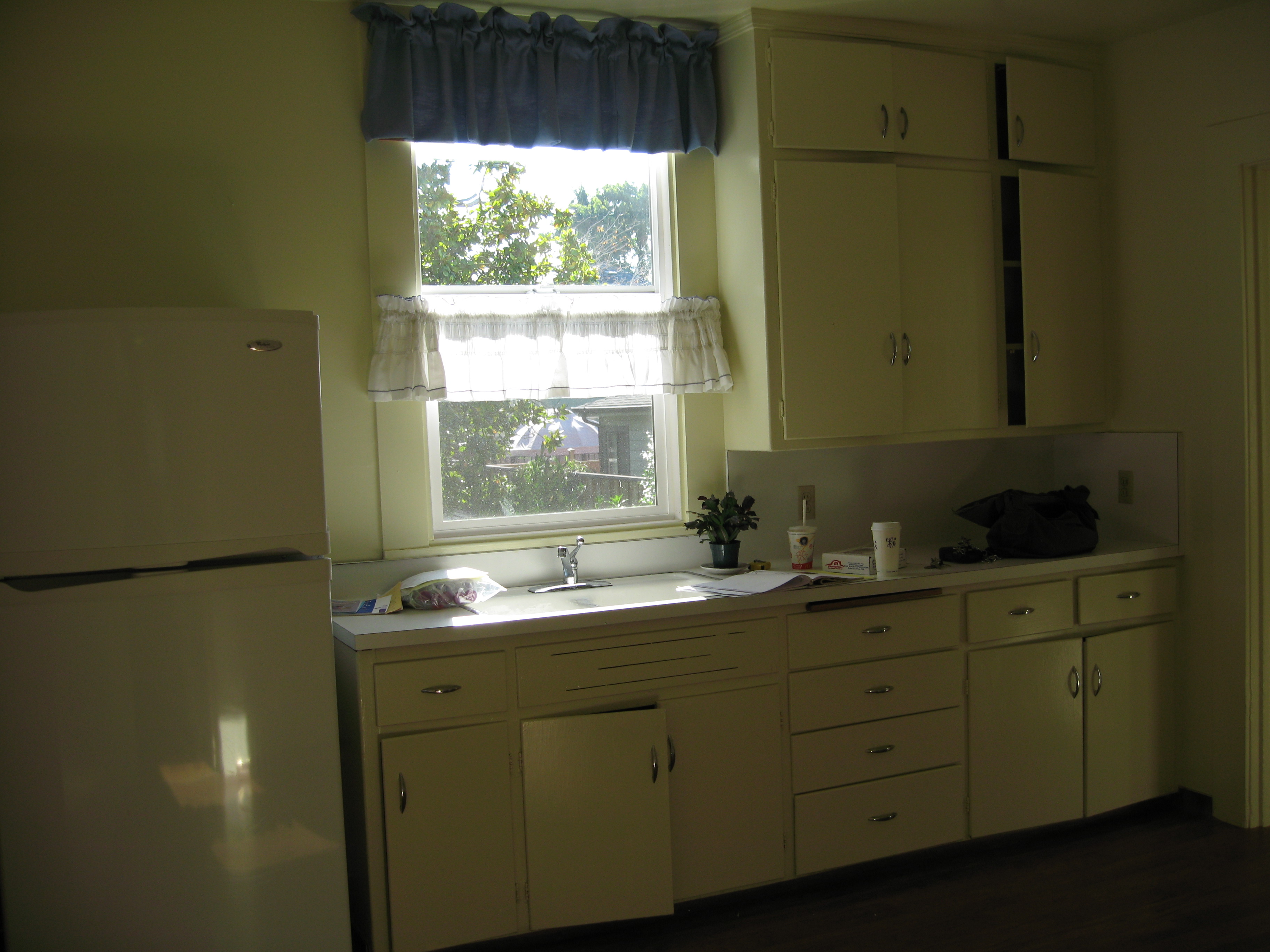
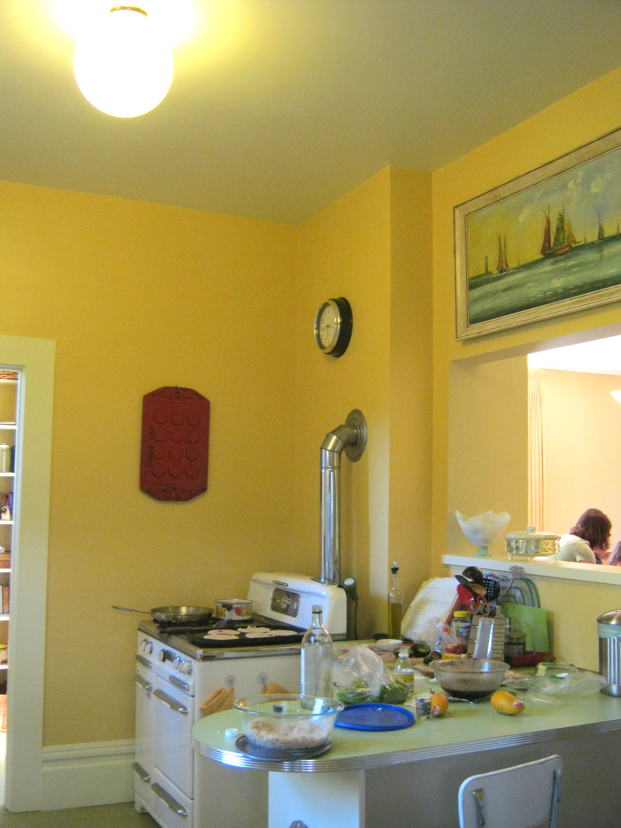
Other features of affordability and style are the colorful plastic laminate counter tops with 50s style metal edge banding, the beautiful green Marmoleum floor (you’ll have to just believe me because you can’t really see it in the photos, & the open space for art that is available because the client didn’t squeeze in as many upper cabinets as they possibly could.
Of course keeping half of the old kitchen was a big cost savings. The new part looks different, but complimentary. Palimpsest architecture is the word for this sort of layering and leaving ghosts of the past rather than tearing out everything and starting over. . http://en.wikipedia.org/wiki/Palimpsest
Contractor: Guillaume Canivet
Cabinetmaker: Rusty Dobbs
Read Full Post »


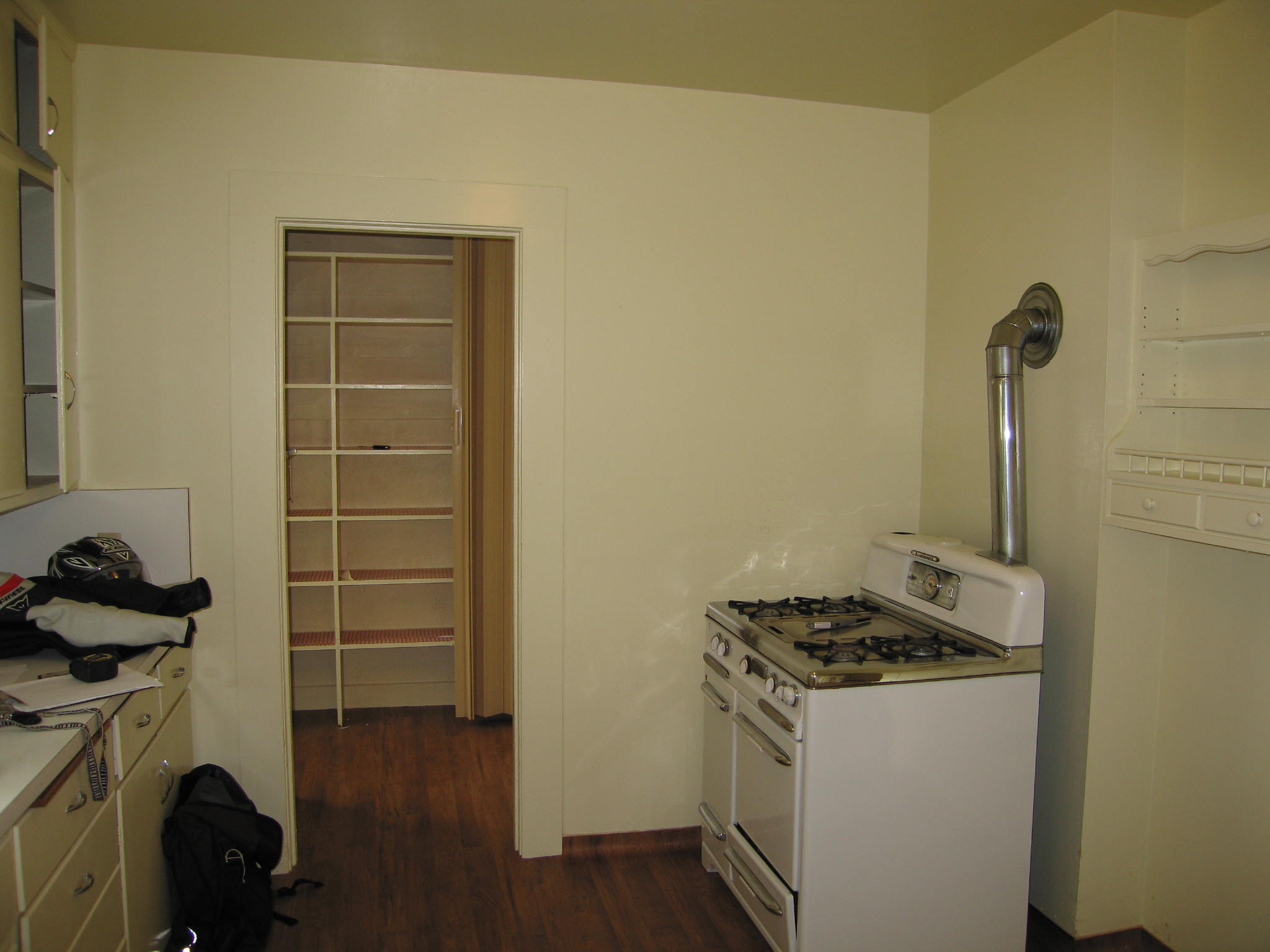
 Custom designed cabinetry to fit the client’s tansu pieces
 Intersection of black, white, and warm wood (the black Paperstone countertop matches the
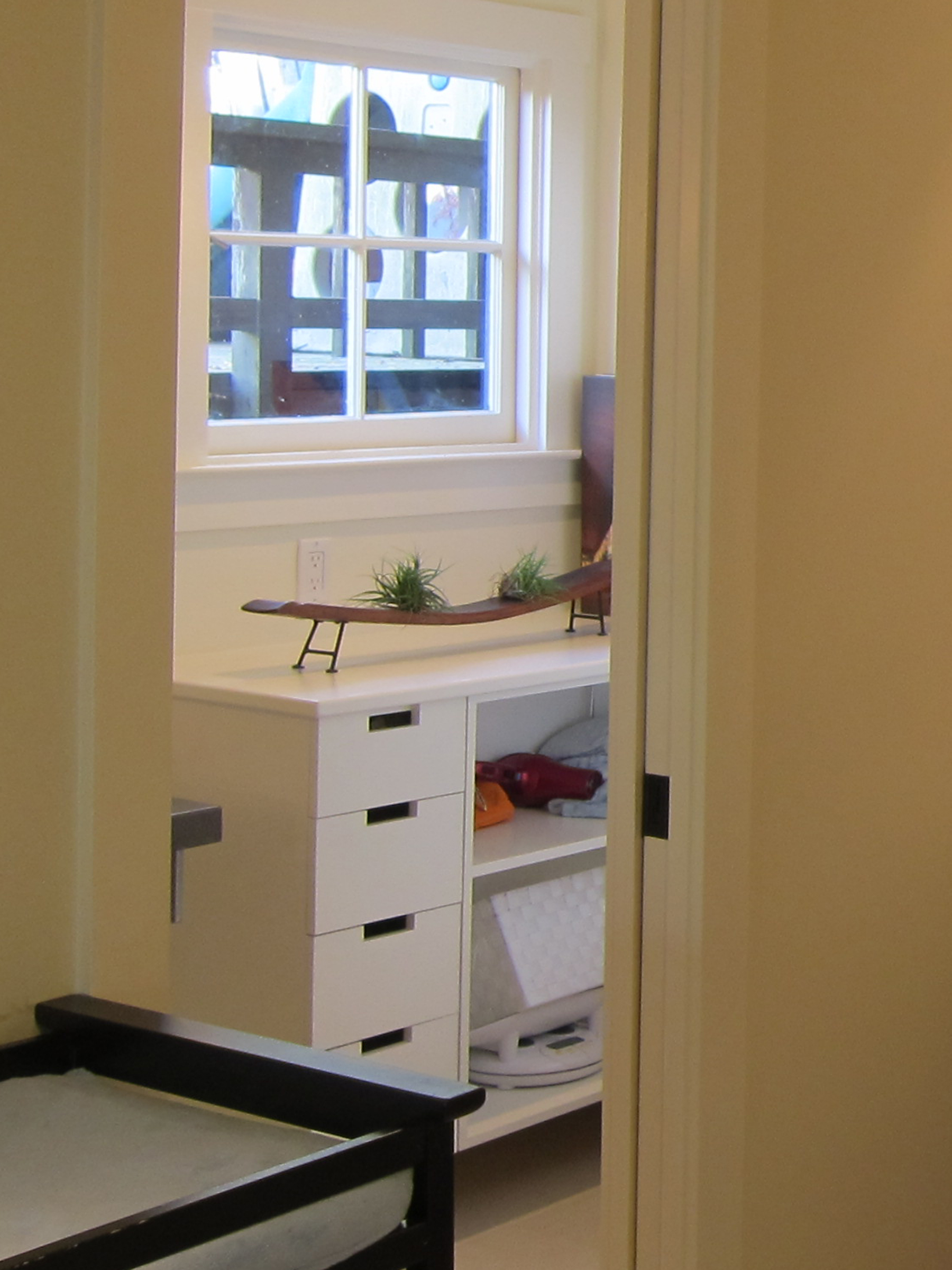
  Laundry and pantry are conveniently close at hand behind a subtle white-painted pocket door
 Architect and client in the new kitchen!